Fi Money
Fi is a fintech startup that provides digital banking solutions. With an aim to provide Indian millennials a new age platform that uses customer insights and deep technology to simplify their banking journey and help them take a big step towards achieving financial freedom.
Founded by ex-Google Pay top executives, It is backed by Sequoia Capital, Ribbit Capital, David Velez (NuBank, Brazil) and Kunal Shah (Cred, India). Fi came to us with an uphill task - to transform the identity and positioning of digital banks in India. Our scope of work involved - brand strategy - naming, positioning, tagline ; brand identity - logo design, visual language, card design, packaging.
As project manager, apart from client servicing and project delivery, I was in charge of brand strategy, card design, and packaging. Find below my work:

Industry
Fin-tech, Banking, Neo-Bank

Scope
Brand Strategy, Brand Identity, Visual Language, Card Design, Packaging

Team
Abhisek Sarda, Indranil Udupi, Vidit Agarwal
Brand Naming
An appropriate name is key for any brand in the banking sector, it had to evoke trust, modernism and echo with the millennials. We had some hard filters defined before the naming explorations:
Single word
No misspellings
Not in use in the fintech sector or well-known brands
Non-functional - no relation to banking or financial terms
Should hint at simplicity, efficiency, and innovation
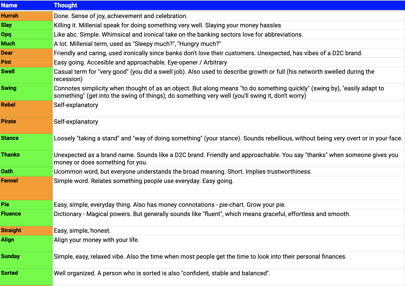
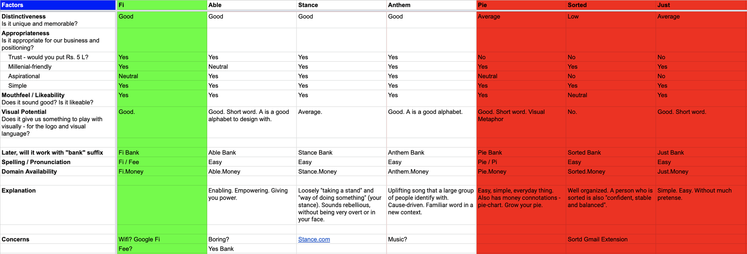
After multiple rounds of explorations, we had a shortlist of about 35 names. We ran these names by a comparison criteria based on:
Distinctiveness - is it unique and memorable?
Appropriateness - is it appropriate for the business? (Trust, Millennial-Friendly, Aspirational, Simple)
Mouthfeel / Likeability - does it sound good?
Visual Potential - Does it give us something to play with visually - for the logo and visual language?
Spelling - is it easy to spell?
Domain availability
We finalised the name Fi, it was a derivative of the older name EpiFi yet ticked all the above filters. The short nature of the word also helped in creating a formidable typemark as the logo. Find below a shortlist of names we proposed, the selection criteria, and a long tail of explorations:


Brand Positioning
We intended to create a lifestyle brand out of Fi, much opposed to the idea of traditional banking. We felt this direction would truly resonate with the target audience - the Indian Millennials. I began articulating functional banking needs and translated this into emotional needs of the user. Lastly, I filtered the emotional needs to propose various positioning directions Fi could take as a brand. Find below a presentation that will take you through this process:


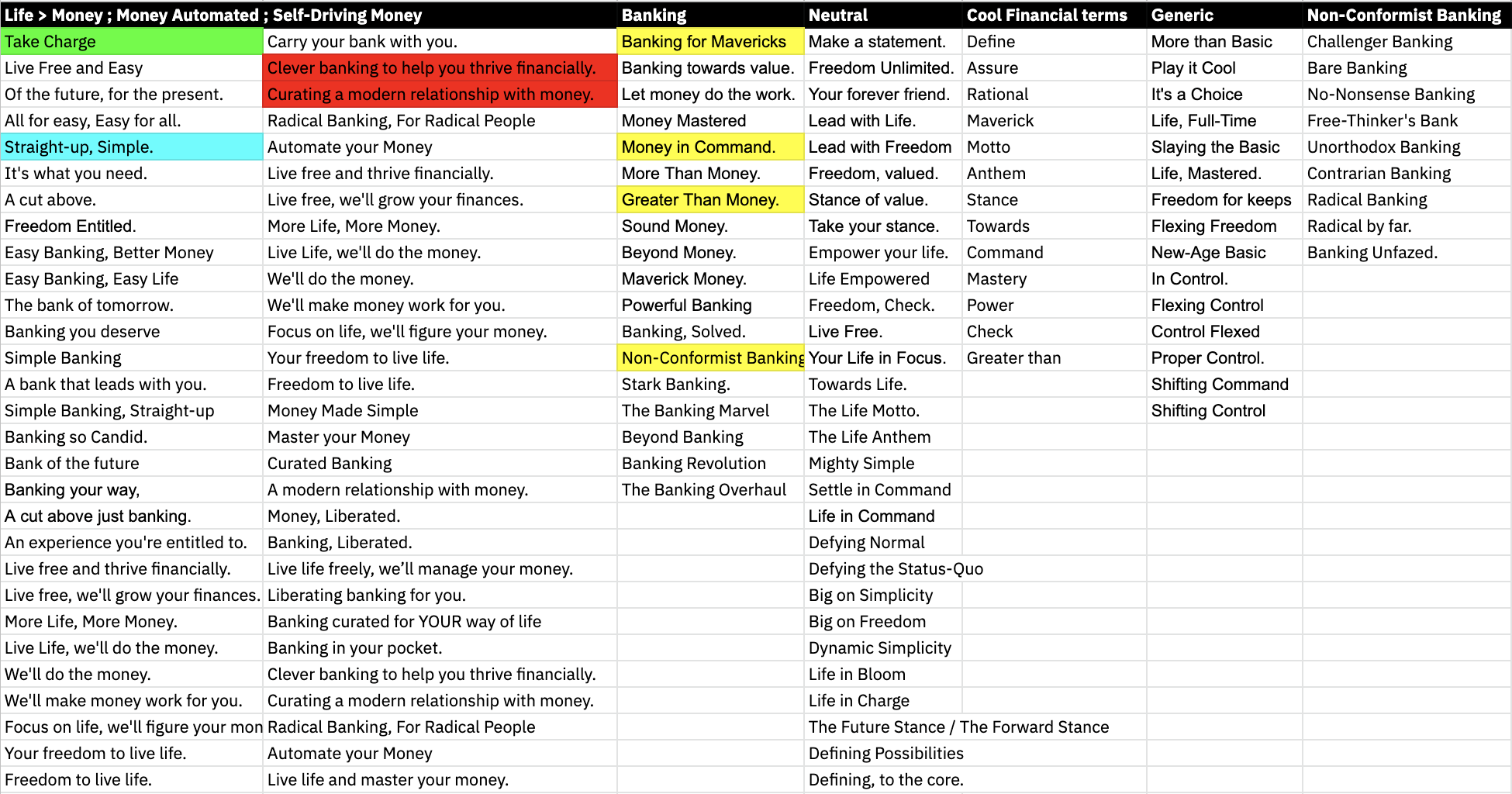
Tagline
Instead of making a hard decision on the positioning statement, we decided to consider all. Reason being - positioning statements have become a thing of the past, while they could serve as guiding principles for the company internally, they have no function in the real world. Therefore, we decided to use the positioning directions as reference points to build on the tagline. For an effective tagline exploration, we had to keep in place certain filters:
Play on emotion not function
Three-word limit
Induce an action
The tagline we finalised - “Take Charge”
Find below screenshots from the exploration exercise:
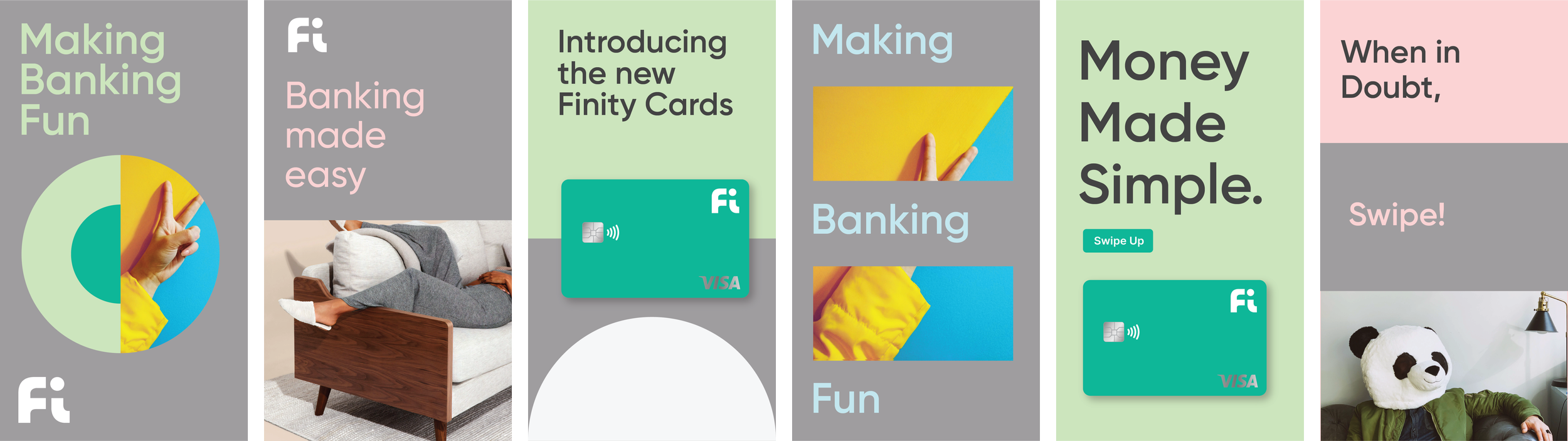
Card Design
The card is the single most important physical manifestation of a digital bank. While the app is important, what most people end up seeing as branded is the card. I was in charge of design, production, and liaising with vendors. This meant thoroughly understanding the design guidelines set by VISA, and translating it into design principles that would help our team design the most unique card in the marketplace. Further, I also had to understand production restrictions pertaining to print area on the card, special effects, and colour reproducibility. After 10 rounds of sampling over the course of 3 months, we arrived at the perfect card. Find below some images:
Packaging & Prototyping
The card had to be supplemented by a unique outer box, which meant creating something out of the ordinary. The challenge here was finding the right vendor to work with. Most vendors in India were used to creating standard packaging for cards - enclosed in an envelope. Therefore, building a relationship with the vendor and pushing them to help us make our design a reality was key. It took us 1 month to finalise the right vendor, and another 3 months of sampling to arrive at a design that we truly loved. Find below our sampling process and final box design:
Learnings
Working with highly accomplished founders was a life changing experience. Meticulous planning and structured project management was a given, but the business insights I gained whilst interacting with the founders will stay as life learnings. Some of them being the knack of providing useful and actionable feedback, setting measurable objectives with each deliverable, listening before judging, and the importance of prioritization.