Evolved Foods
Evolved foods is one of India’s first few 100% plant-based food companies, who are on a mission to bring human and planetary health to the forefront. Their objective is to provide healthier, sustainable, and delicious plant-based food in ready-to-cook and ready-to-eat formats to the health-conscious Indian.
The Evolved Foods team (founders + investor) came to us with the request of building the brand identity and creating a unique packaging design for their product. The clients had trademarked the name Evolved Foods, so we had to work with this constraint.
As project manager, I was in charge of execution and delivery; on the creative spectrum, I was responsible for market research and creative direction of packaging design. Find below in detail my approach to the project:

Industry
Alternate Protein, Food and Beverages, Retail

Scope
Visual Identity, Packaging Design

Team
Abhisek Sarda, Indranil Udupi, Priyanka Poulose, Sanjana Hegde
Market Research
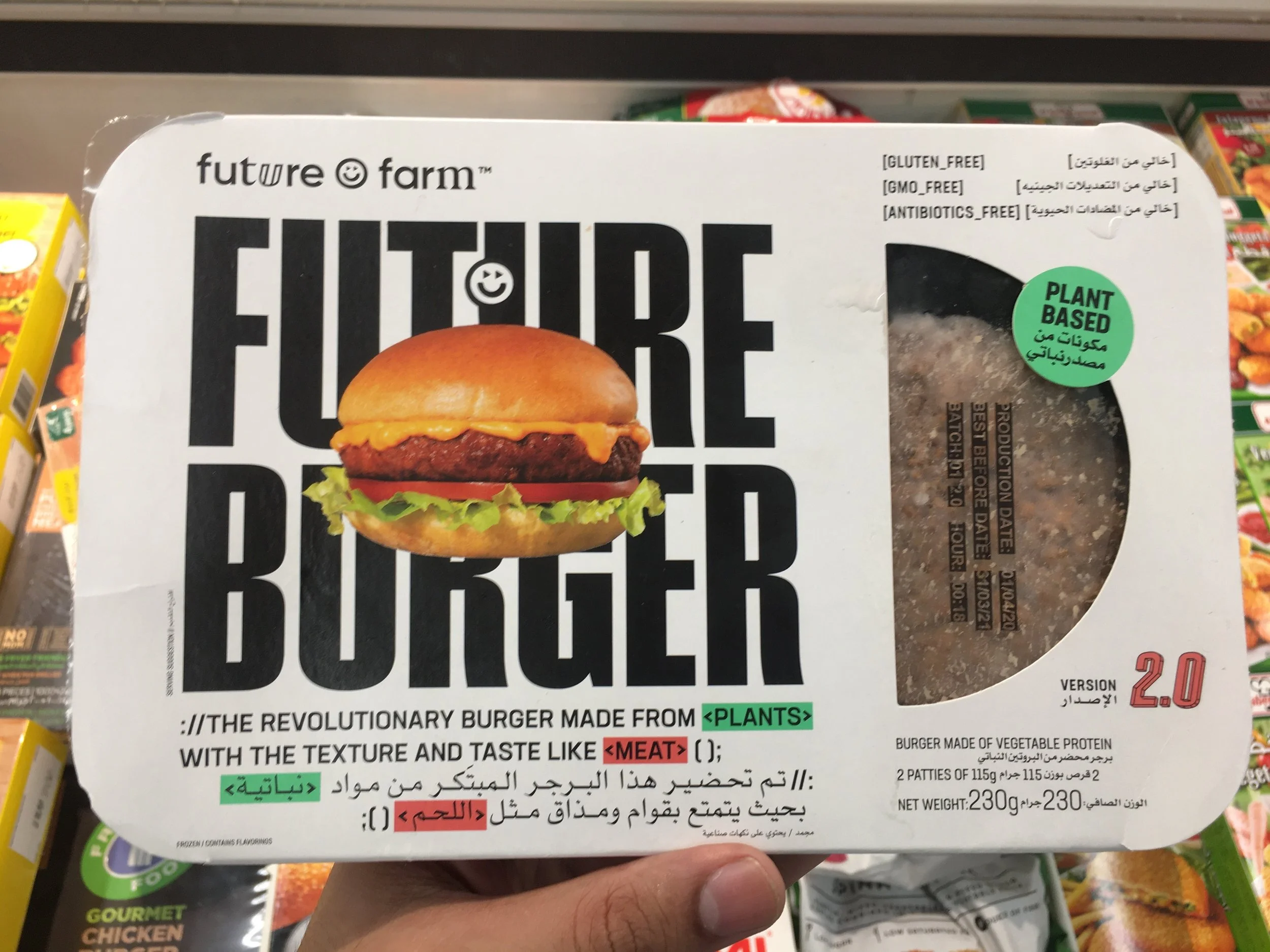
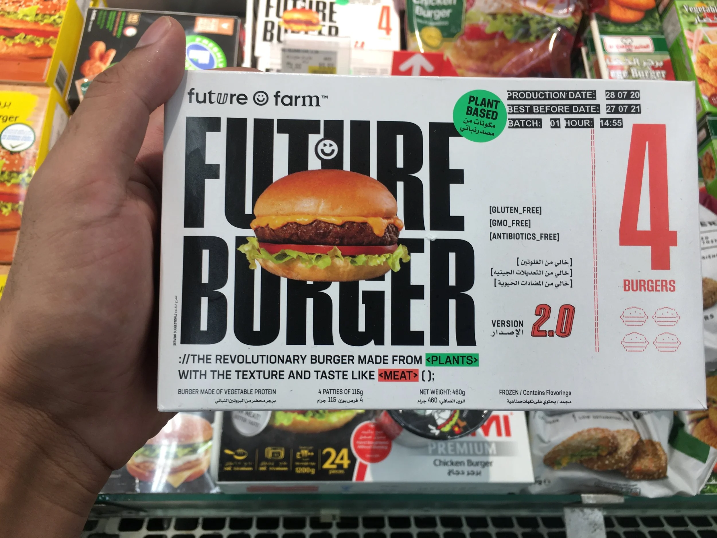
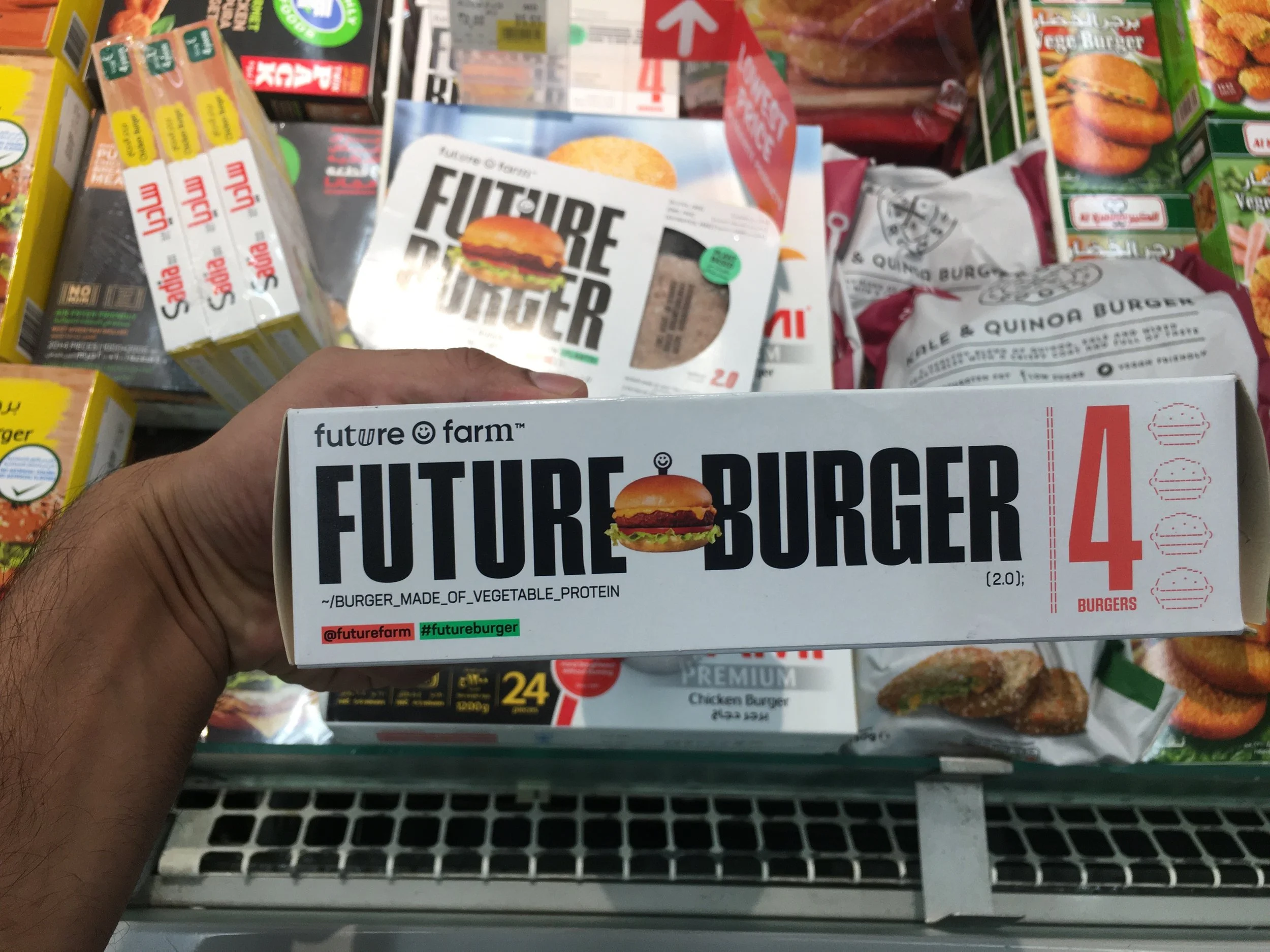
Since the plant based food space is still in its nascent stages in India, most of my research was based on international markets and standards. Luckily to my advantage, at the time of managing this project, I was working remotely from Dubai, UAE - a market which is fast catching up on the plant-based food scene. I was able to scan and understand the sentiment of both ready-to-eat products at stores and meat-alternative food at restaurants.
A culmination of my research brought out the fact that since India is a new space for plant-based brands and products, we need to build an identity for the brand that is easily relatable. This meant, identifiable metaphors like the usage of a green colour palette, icons and imagery of plant and muscle, playful typography and see through packaging as the core identity of the brand. Some images from my market visit:
Packaging Design & Content Structuring
As a product that will sell on retail shelves and e-commerce stores, packaging design is the single most important factor to grab a buyer’s attention and nudge a purchase. The creative director, designer and I worked in cohesion to create the packaging. I was responsible for directing the placement of key elements and content pieces on the packaging.
To make it easier for the client, I created a structured system for decision-making on the packaging:
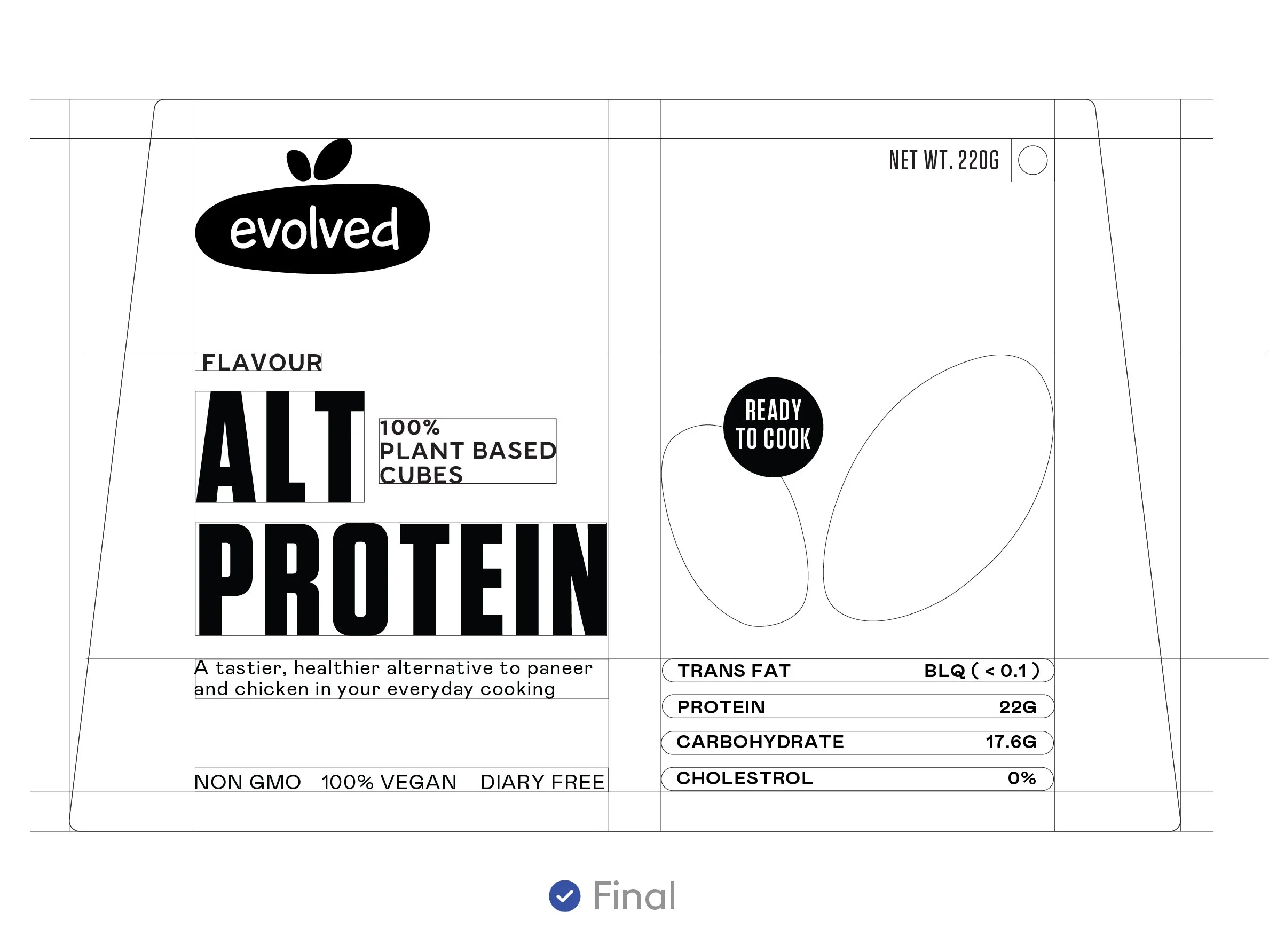
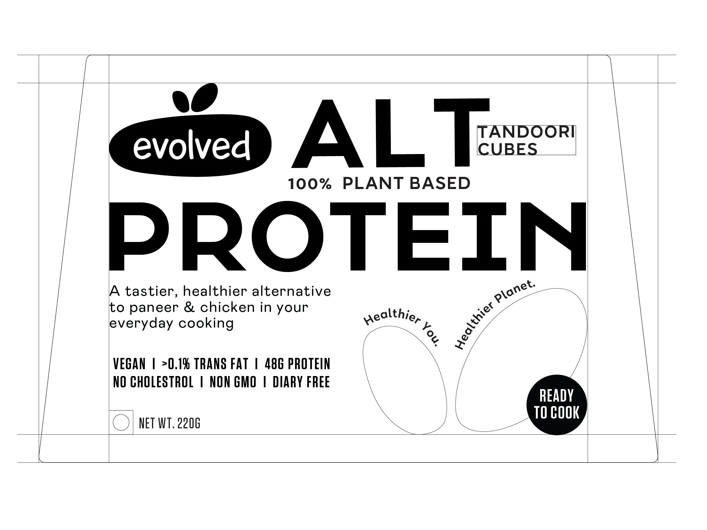
1) WIREFRAMING
Here we provided unique formats of content presentation and structuring on the front of the pack. The clients would make judgements based on content placement, significance of content buckets, and the content itself. They would then select the wireframe that made the most sense. Find below the wireframe options:
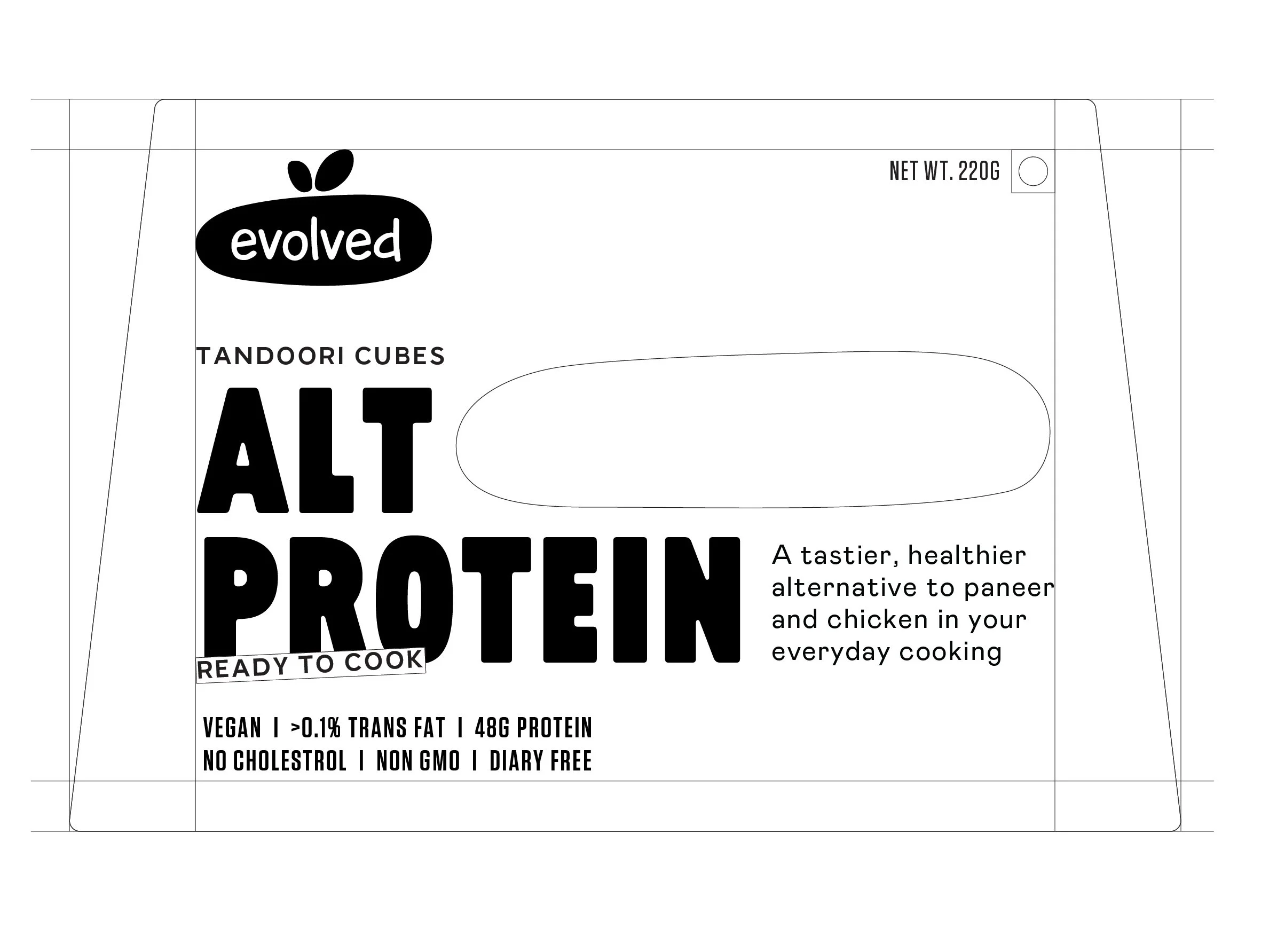
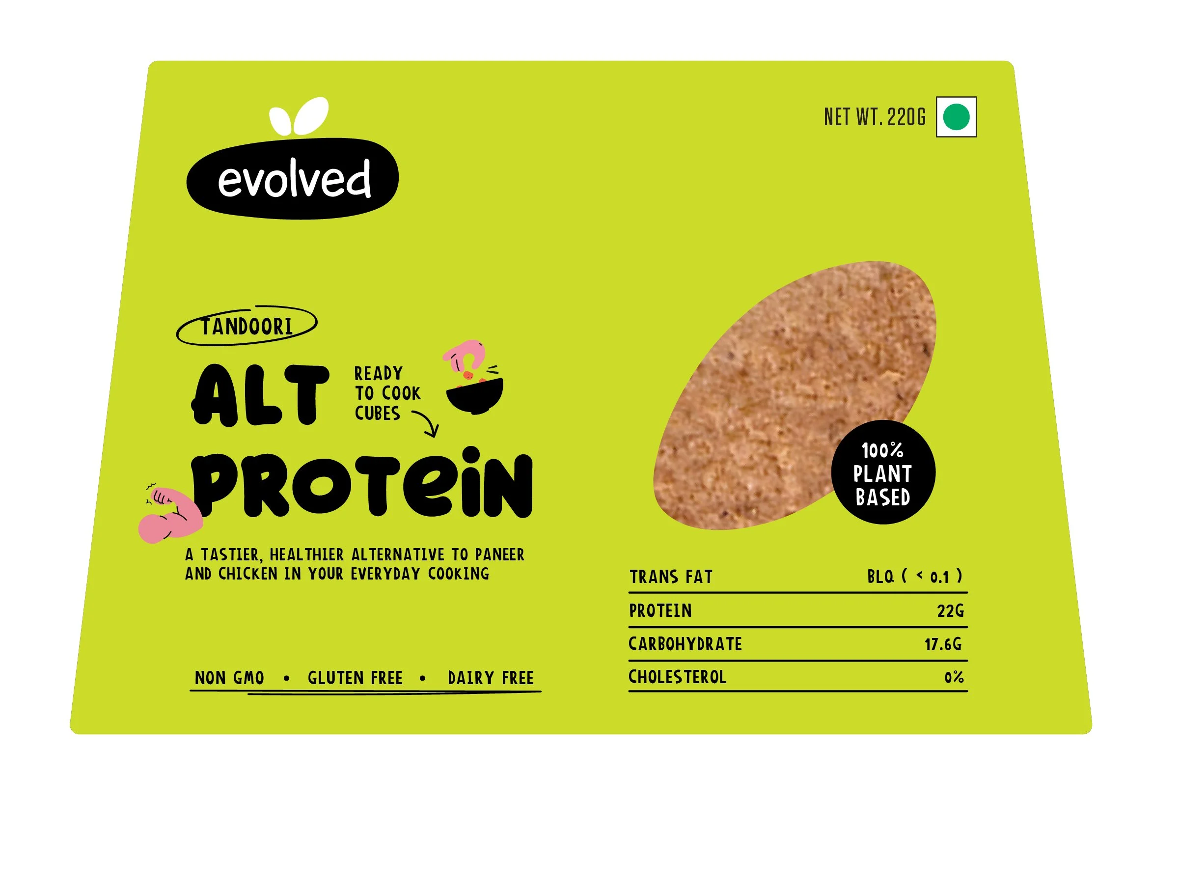
2) AESTHETICS
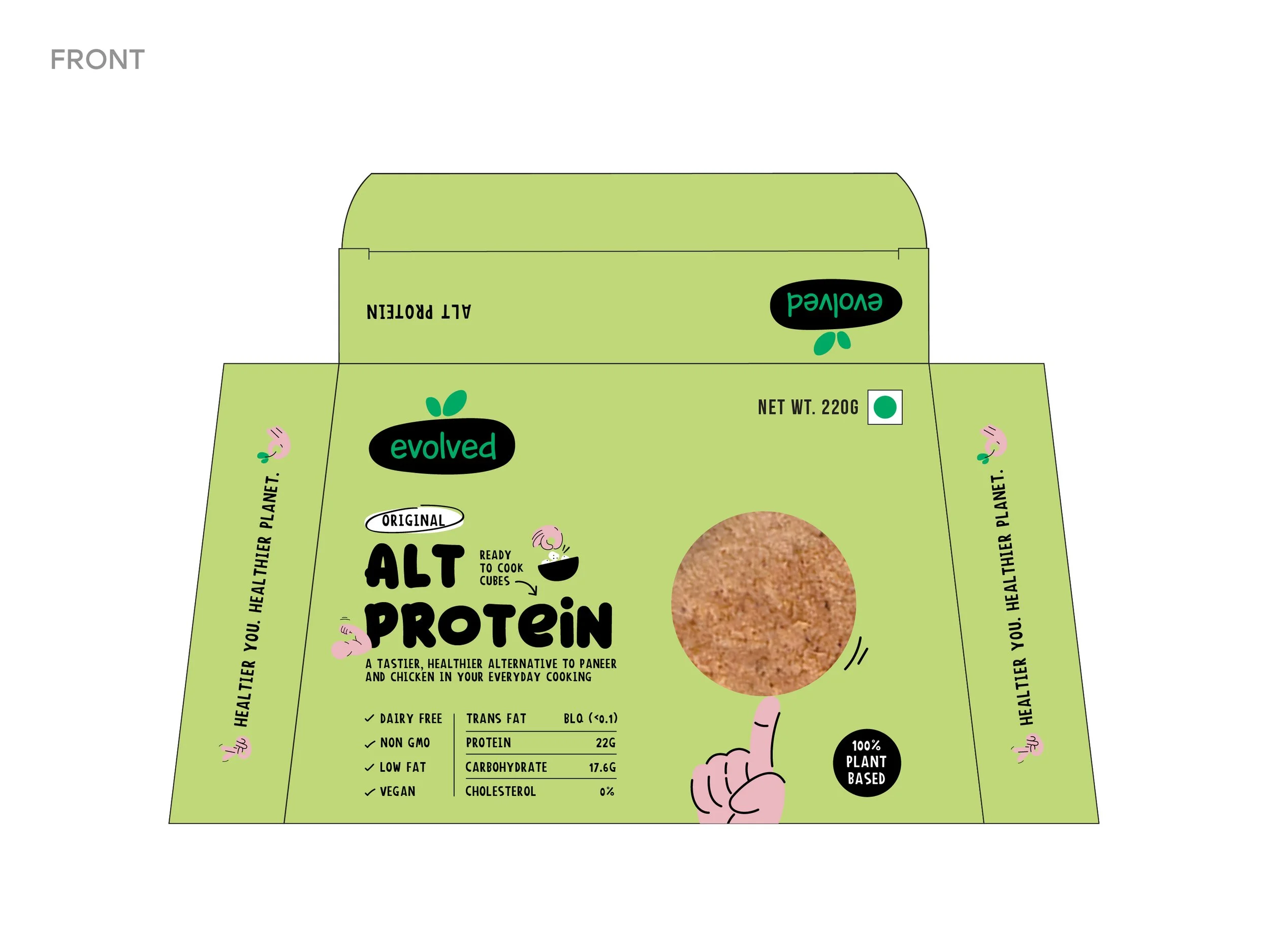
Here we exhibited various aesthetic explorations of the packaging, based on the selected wireframe. The choice to be made was based on the emotions the packaging would evoke - playful, homely, healthy, natural, friendly, approachable. We arrived at a consensus of selecting the design that had a finger rotating the globe - which abstractly meant, “your health and the planet’s health at your fingertips”.

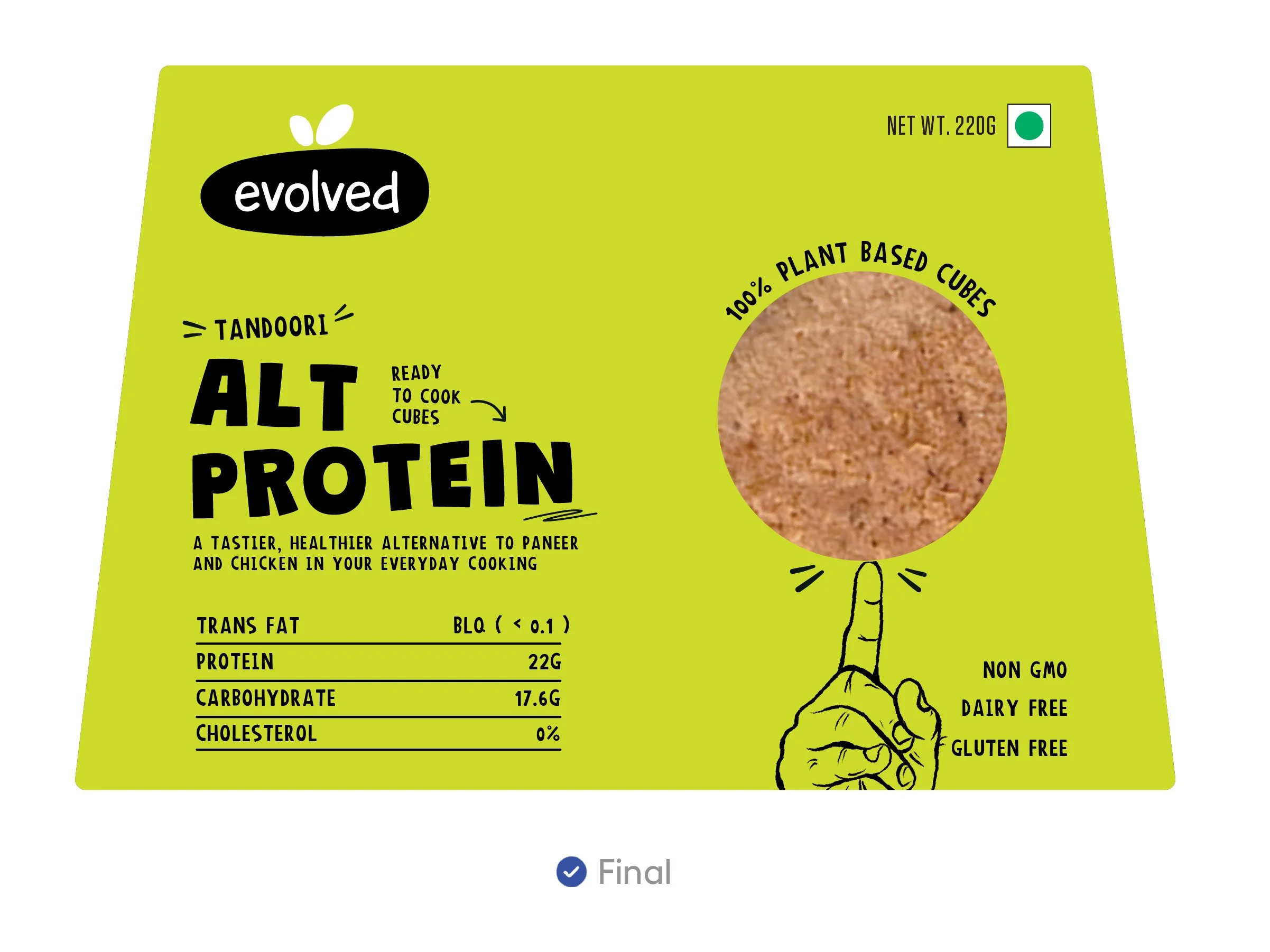
3) CONTENT
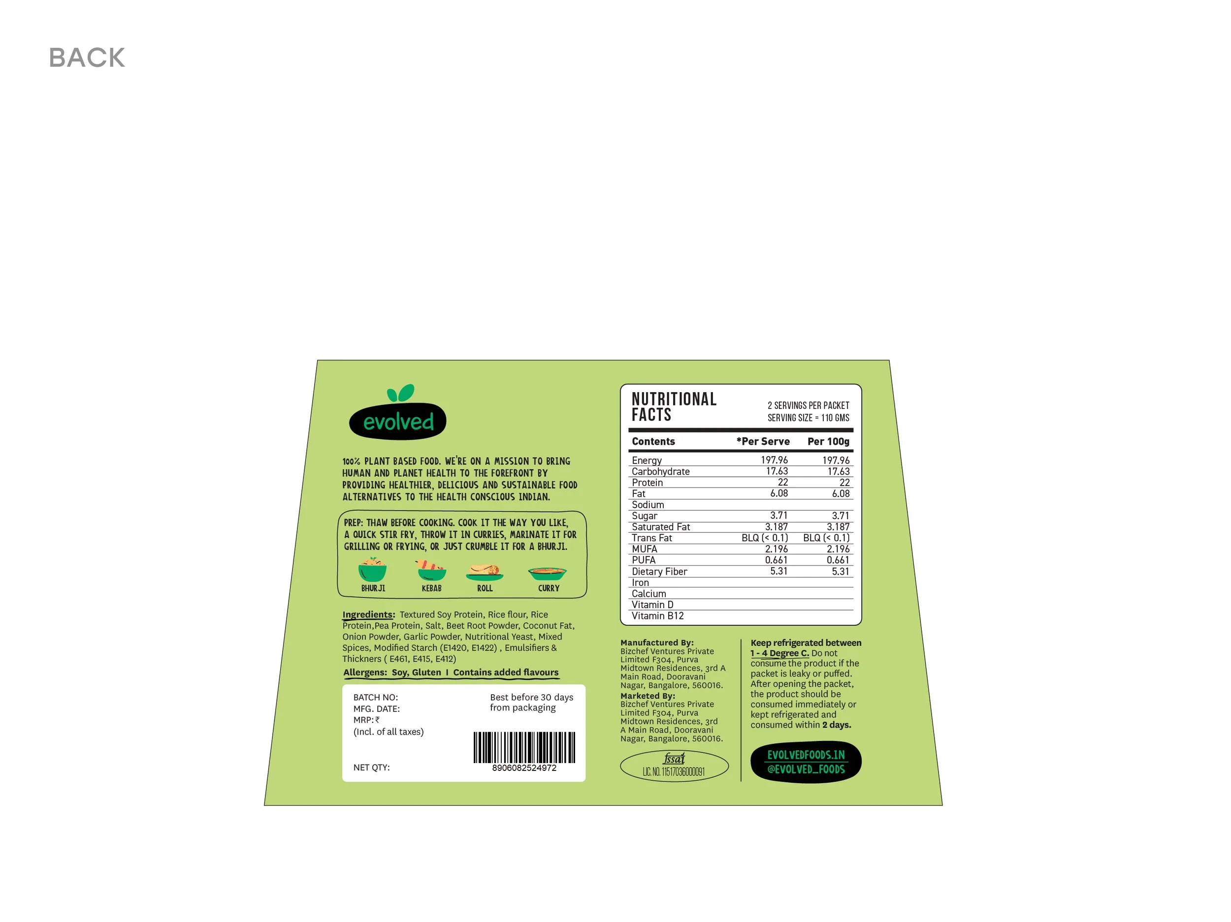
Plant-based food is unknown territory for the average Indian consumer, therefore, the content had to speak to them in a way they felt comfortable trying the product out. While the iterations over here were limited, I made a series of refinements to the content over the course of the entire packaging exercise. Here the client trusted our judgement, so we had no client discussion on this.
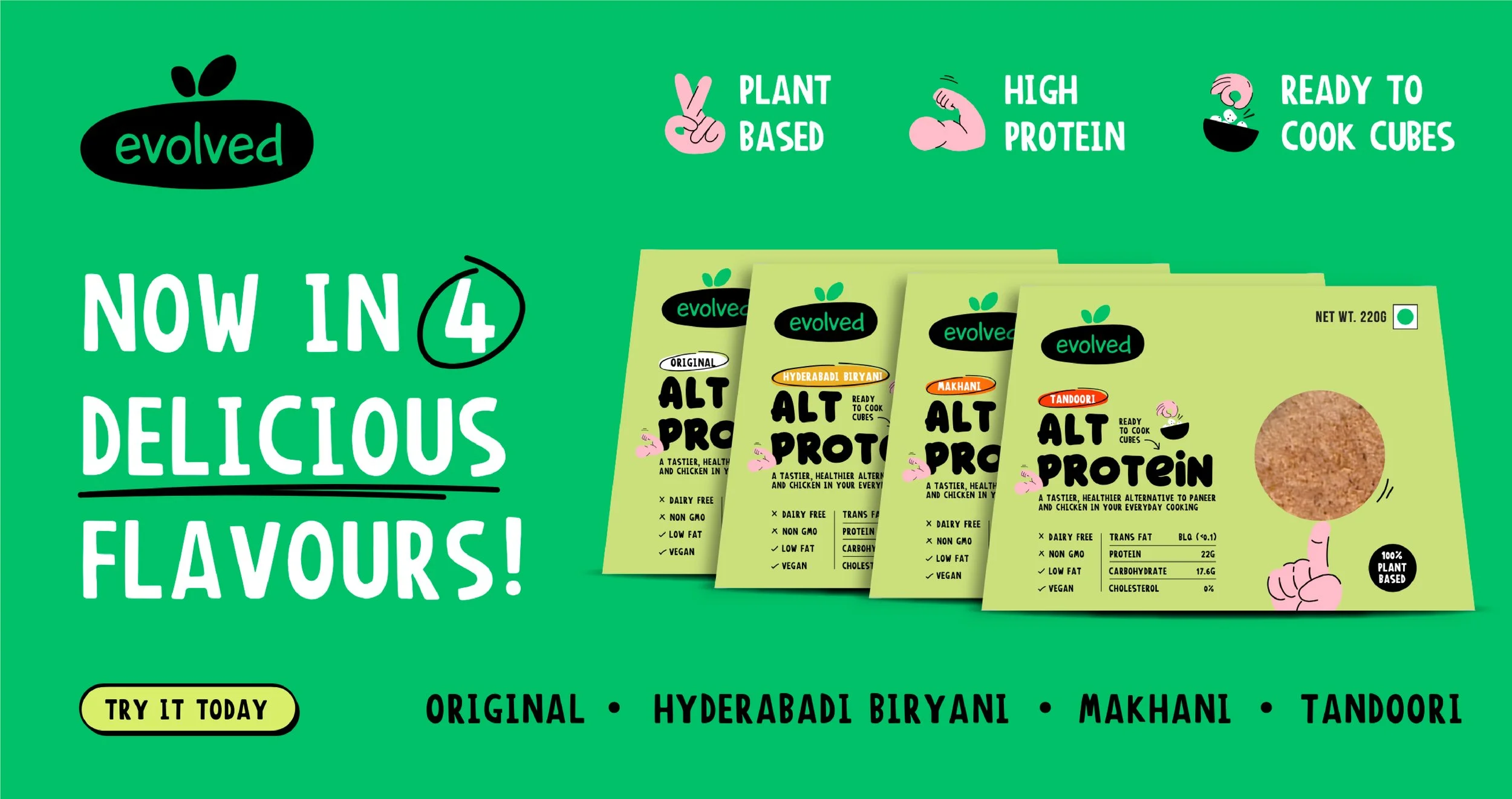
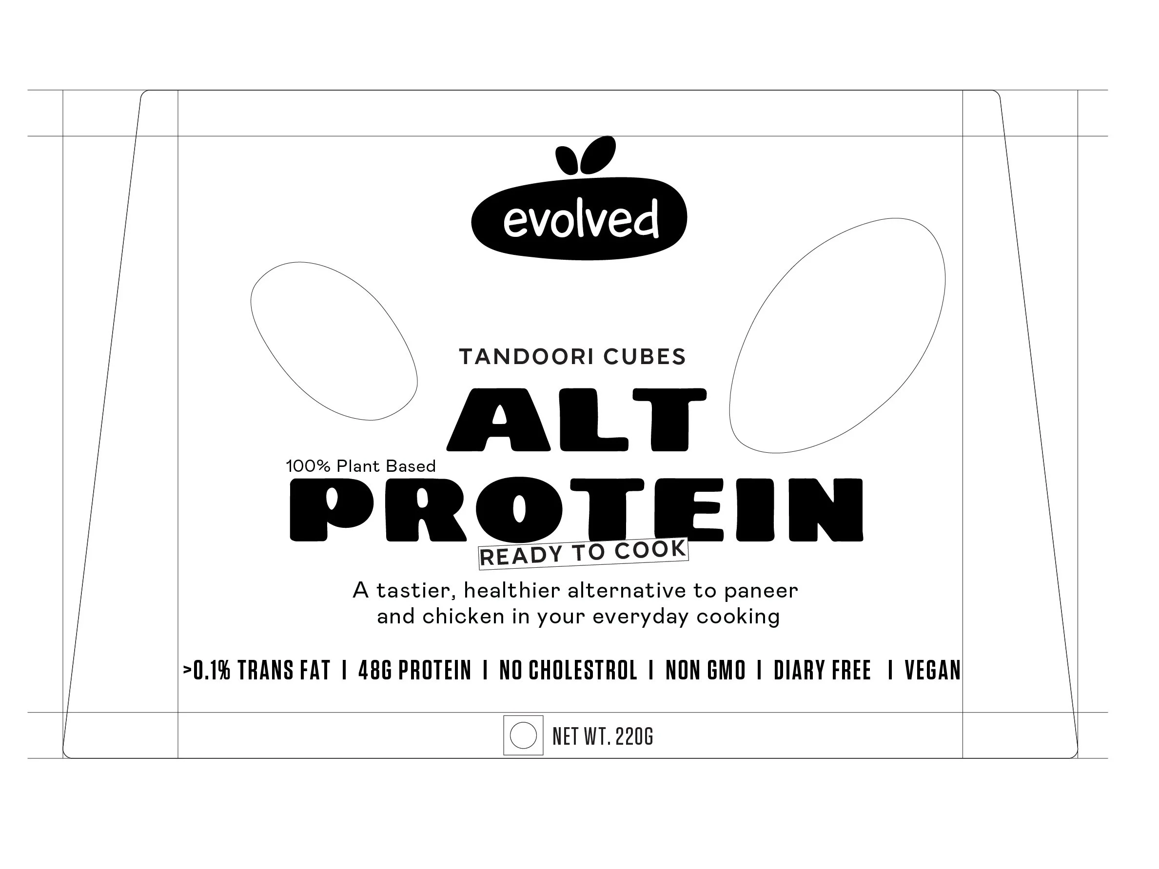
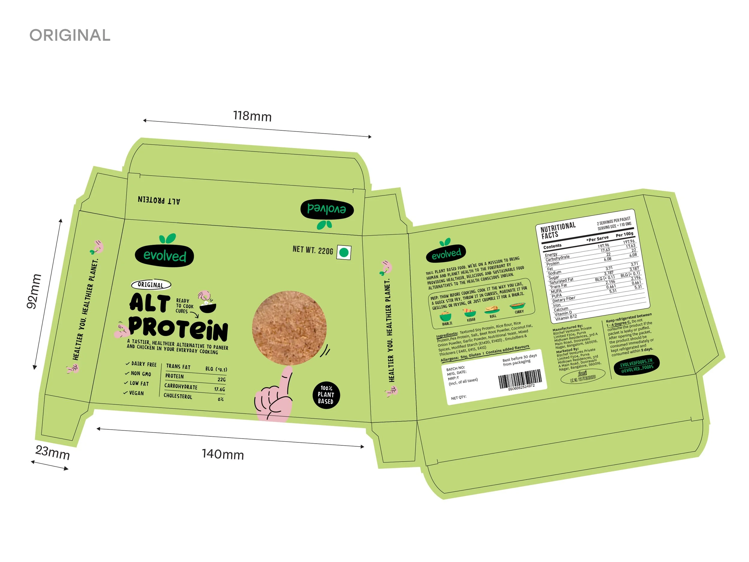
Final Packaging
We arrived at a packaging design that the clients were extremely satisfied with. The typography used had just the right amount of playfulness that did not take away the trust we wanted to build. The iconography and illustration style evoked a sense of friendliness. The bold nutritional facts on the front brought out a sense that the brand was confident of their offerings.
Learnings
The clients were building a brand to help people live a healthier lifestyle while also saving the planet. We at Opposite were designing for people so that they could make an effortless decision to choose plant based foods. Empathising with people and the planet was the sentiment through the execution of the project. This project made me realize the importance of putting people’s needs at the core of creation, and building a brand through empathy.