Antidote Coffee
Through this project, I had the unique opportunity of working with Delivery Hero, a global leader of a worldwide network of food delivery apps, operating in 40+ countries and processing more than 400 million orders yearly. The new business initiators at Delivery Hero approached Opposite HQ, with an idea to create a delivery-only global coffee chain brand, targeting young professionals and coffee lovers. They would set up ghost-kitchens at multiple locations in a city that would allow for coffee to be delivered within 10 minutes of placing the order.
The task at hand - to develop an identity for a cafe that did not physically exist. This brand had to work across 4 global regions namely the Middle-East, Europe, South-East Asia, and South America.
My role involved end to end execution of the project, creating the brand name, and supporting creative direction of the visual identity.

Industry
Food and Beverages, Quick Service Restaurant (QSR)

Scope
VIsual Identity, Packaging Design

Team
Abhisek Sarda, Priyanka Poulouse, Indranil Udupi
Brand Tagline
Often large organizations are only used to working with macro-level project deliverables, but it is the expertise of a studio that understands the importance of granular project scoping. With this project, I scoped out the nitty-gritty’s of the large deliverables to allow for better clarity to the client and meticulous project execution on our end.

Project plan with deliverables and discussion topics.
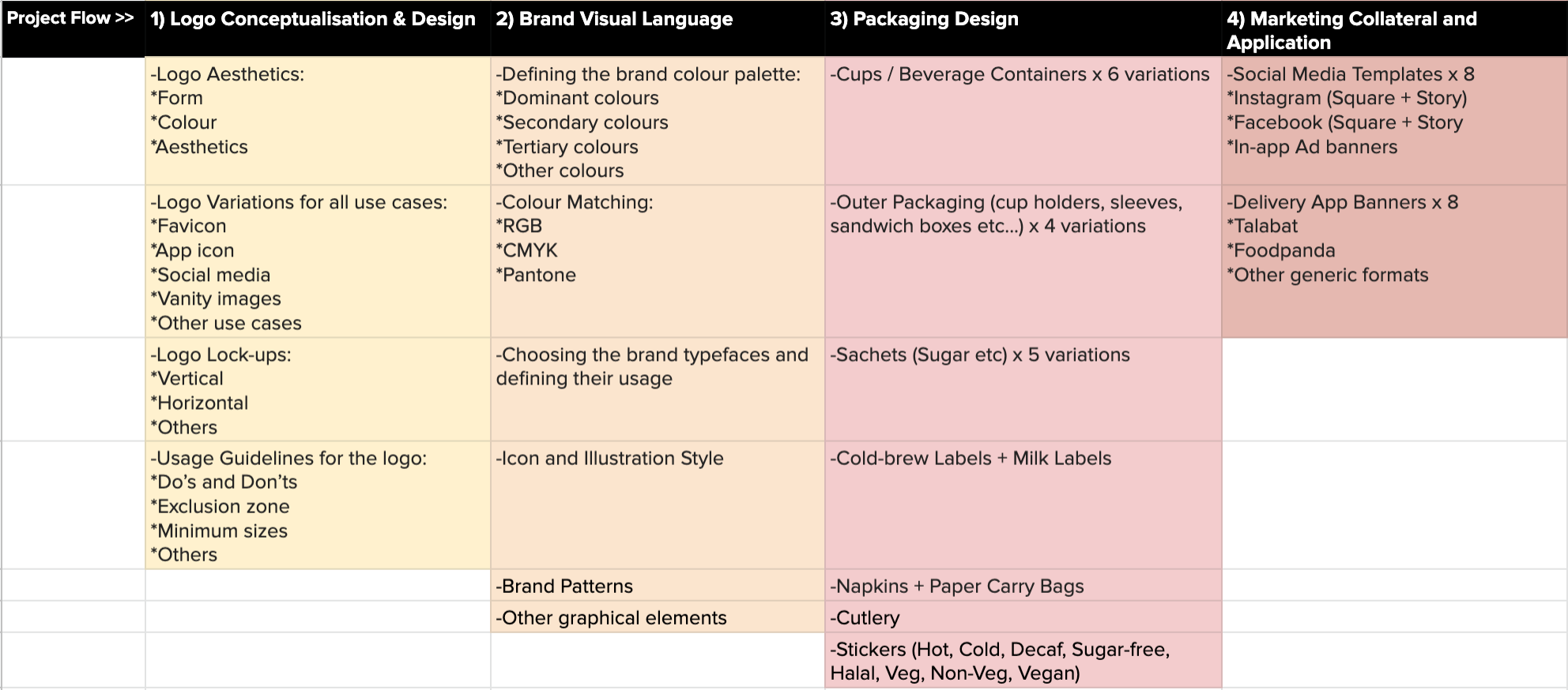
The project scope and flow.
Naming Exercise
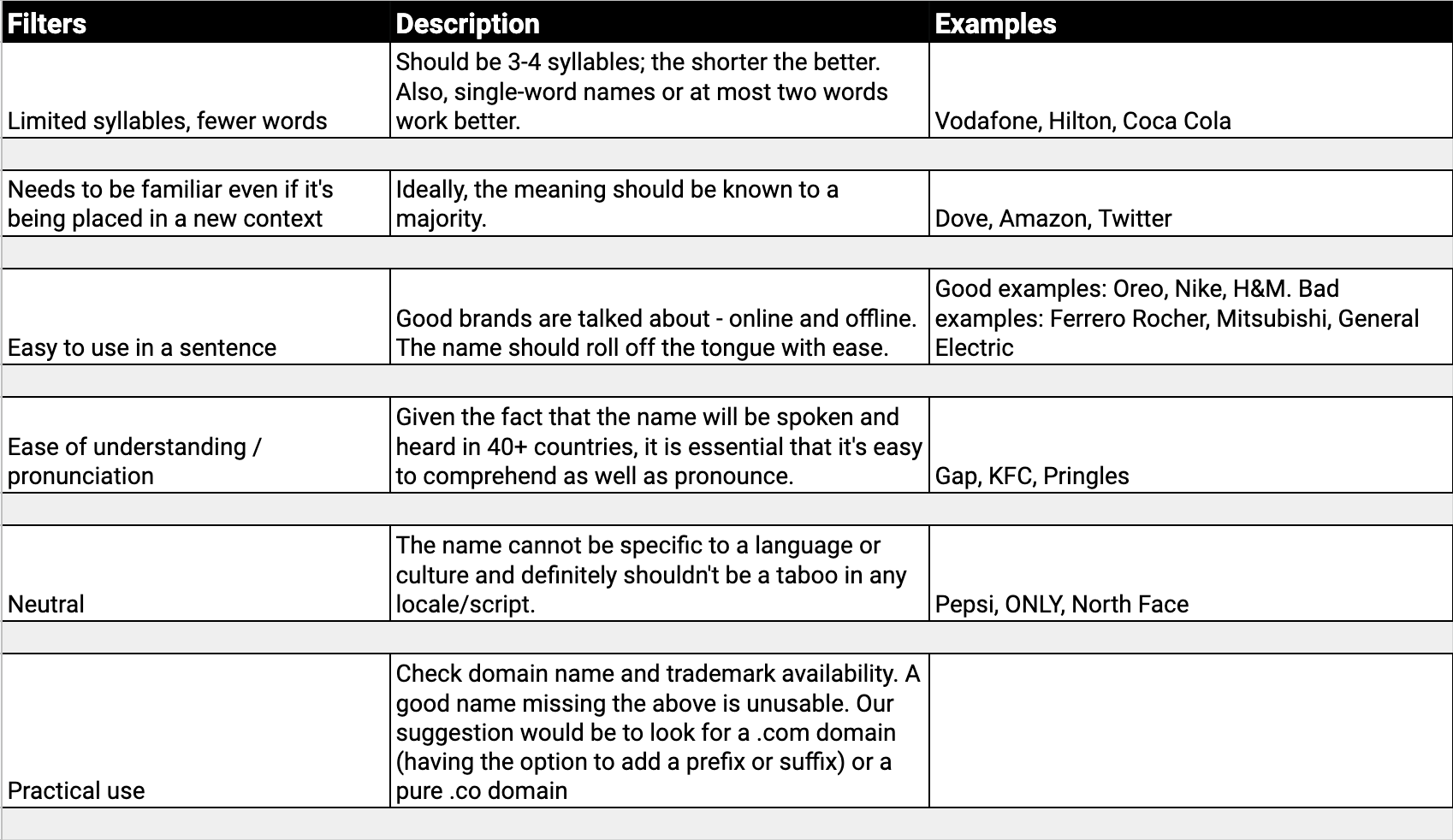
Considering the wide target market, the name had to be fairly easy to understand but one which stood out. One of the main filters we had in place while exploring names was to be wary of the language and other deeper sensitivities of the regions the brand would exist in.
A very unique example of this consideration: Arabic does not contain the letter ‘P’, so every word containing the letter ‘p’ would be pronounced as ‘b’. For eg: ‘Prose’ would be called ‘Brose’ which would lead it to mean something entirely different. ‘Mighty Cup’ would be called ‘Might Cub’. Since the brand was first launching in the Middle-east, we had to consider names very carefully. I lived in the Middle-East for a major portion of my life, so my knowledge of the region was welcome help.
Find below screenshots from the naming exercise:
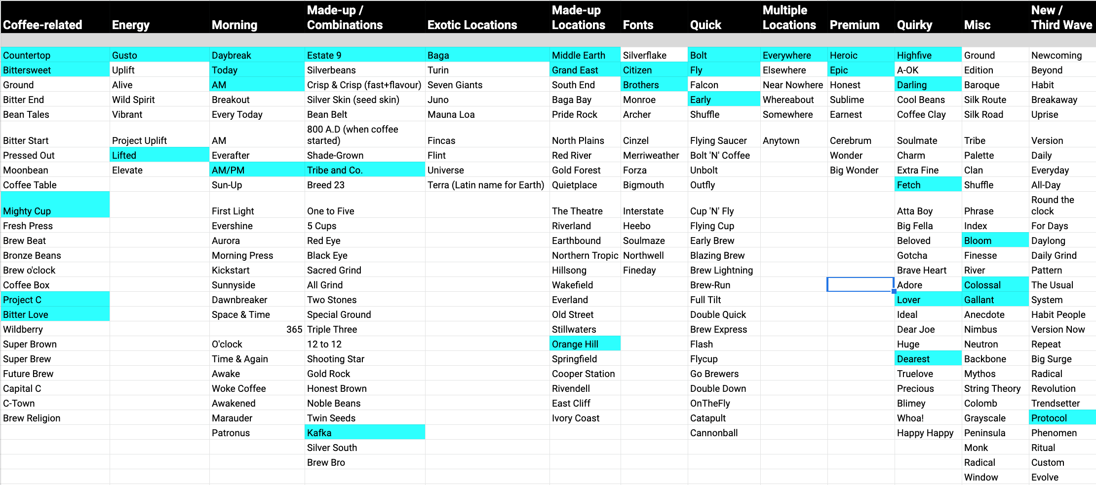
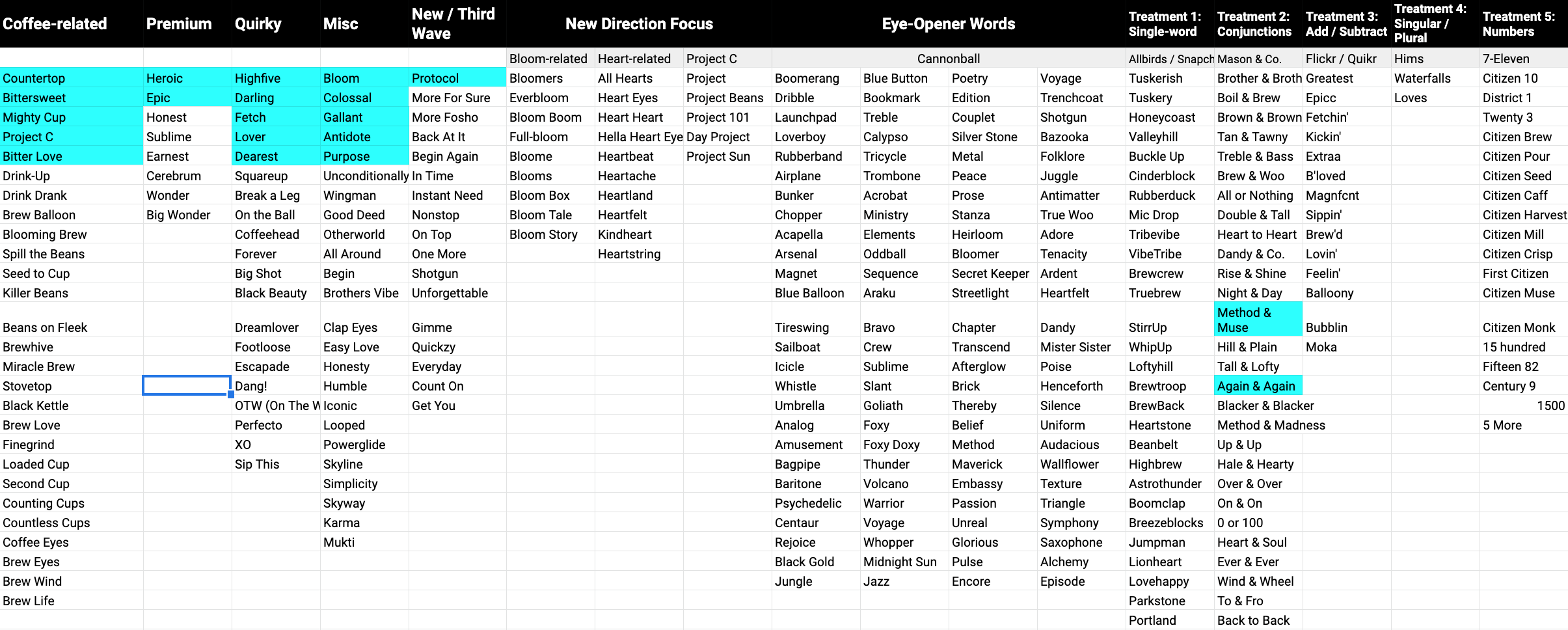
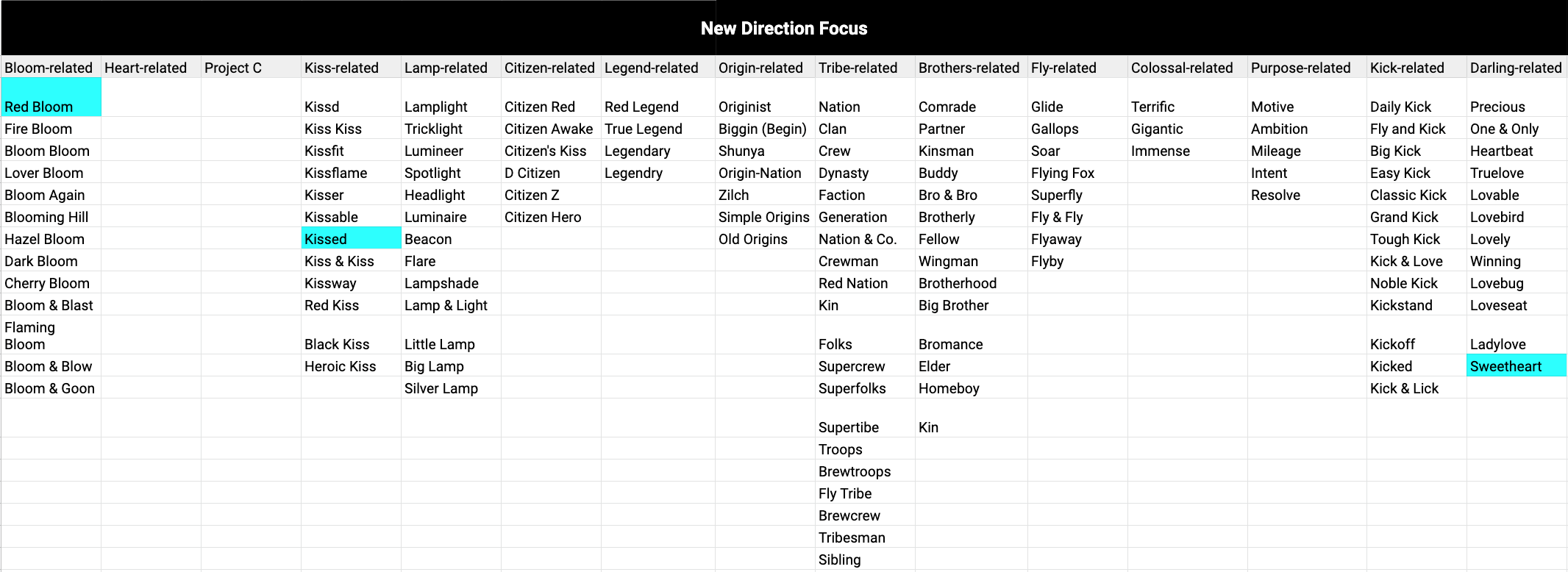
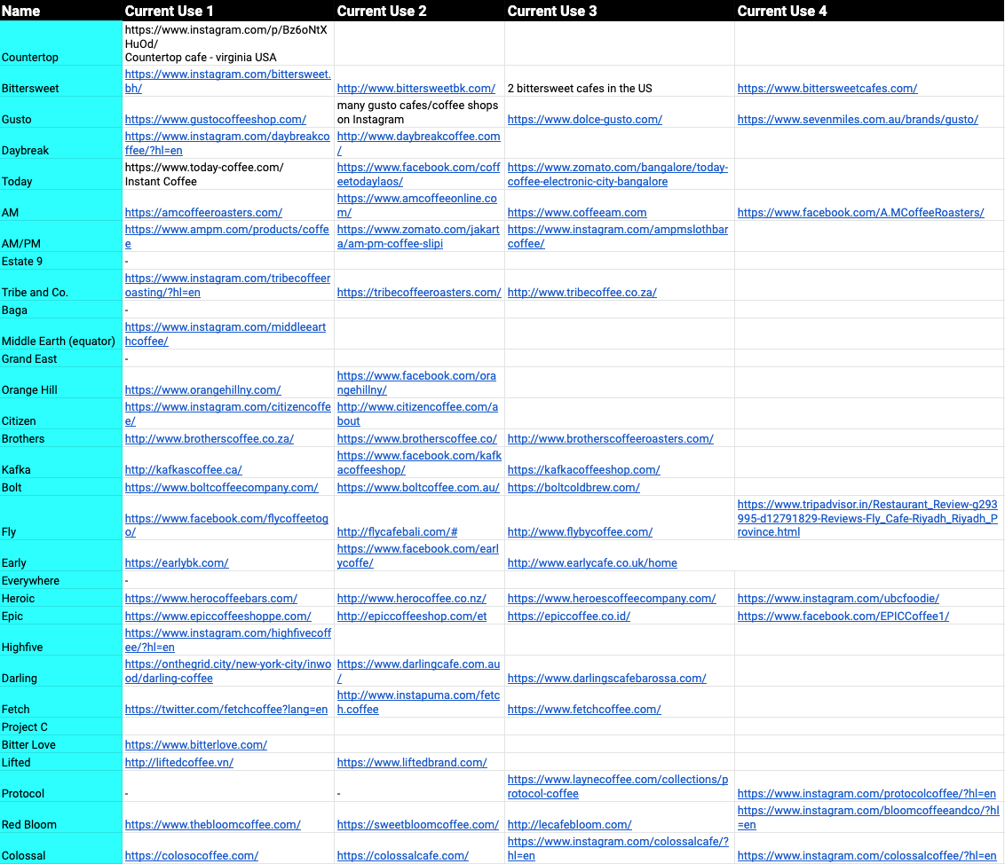


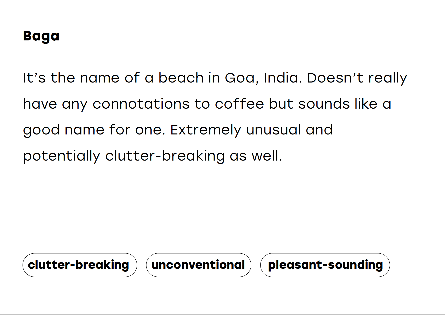
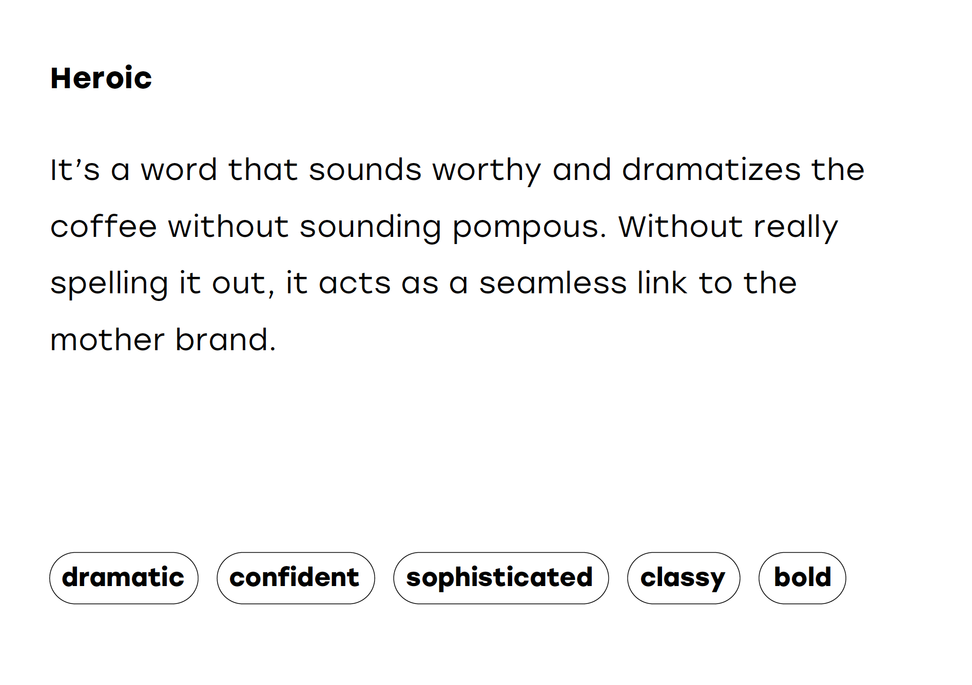
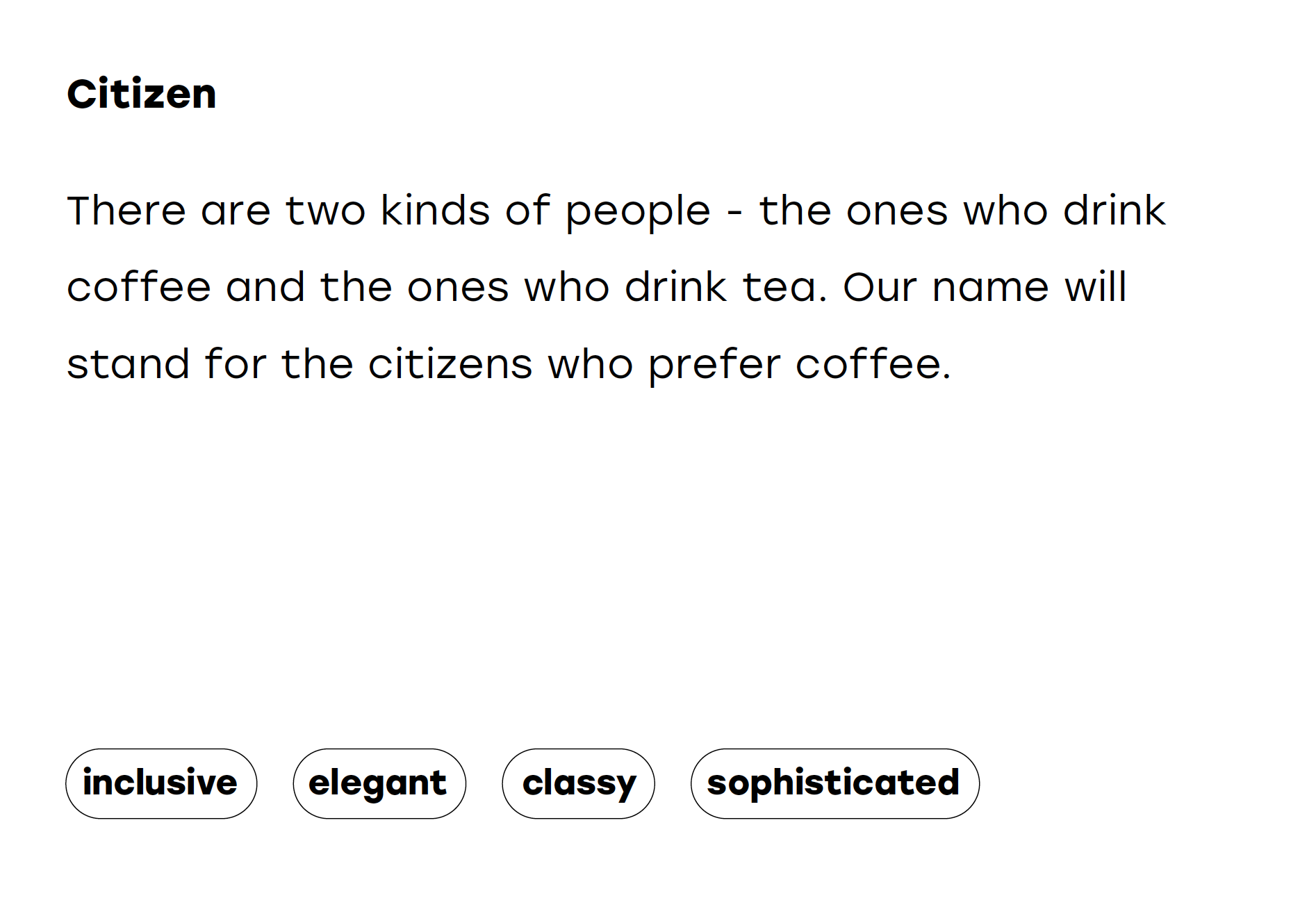
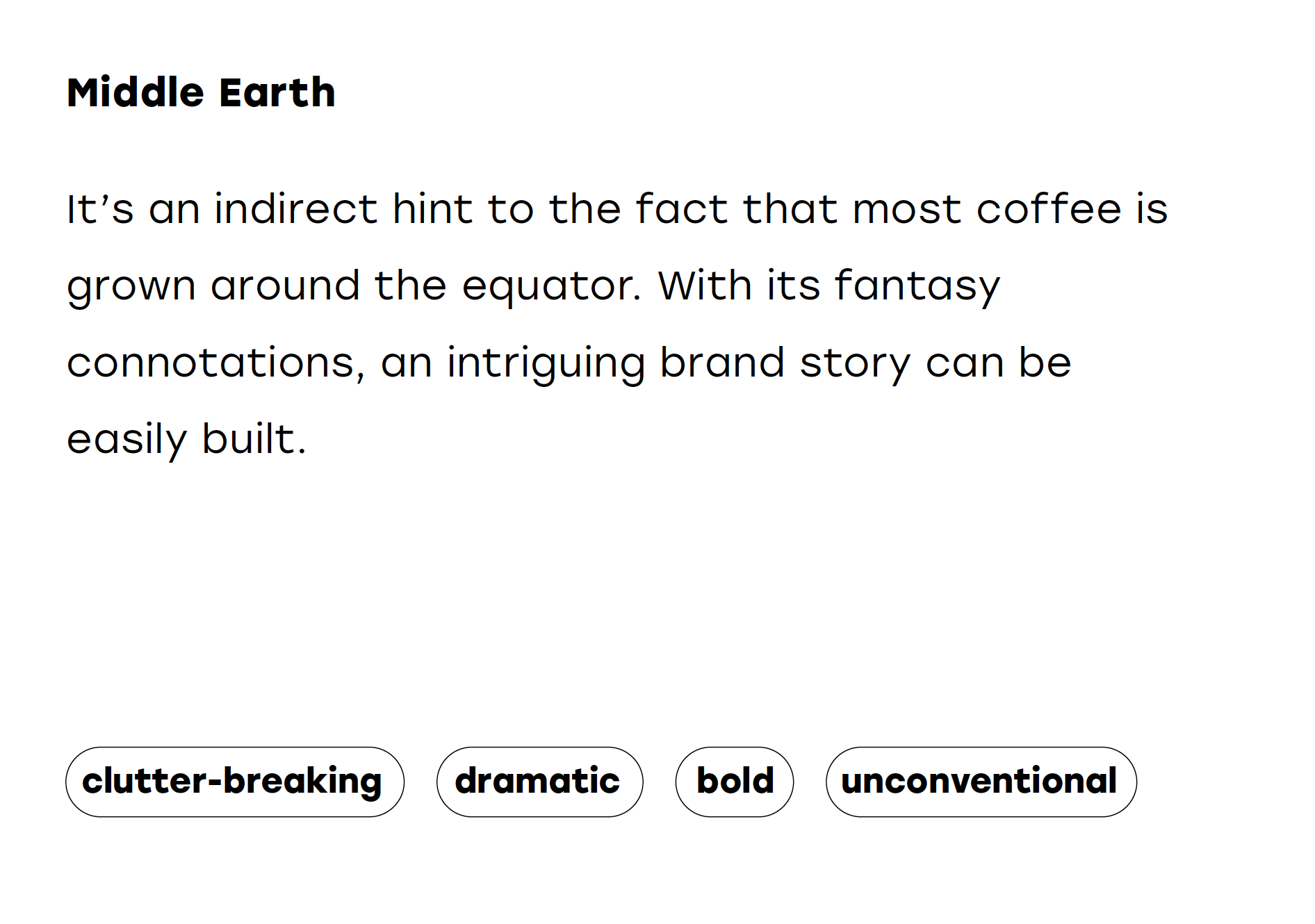
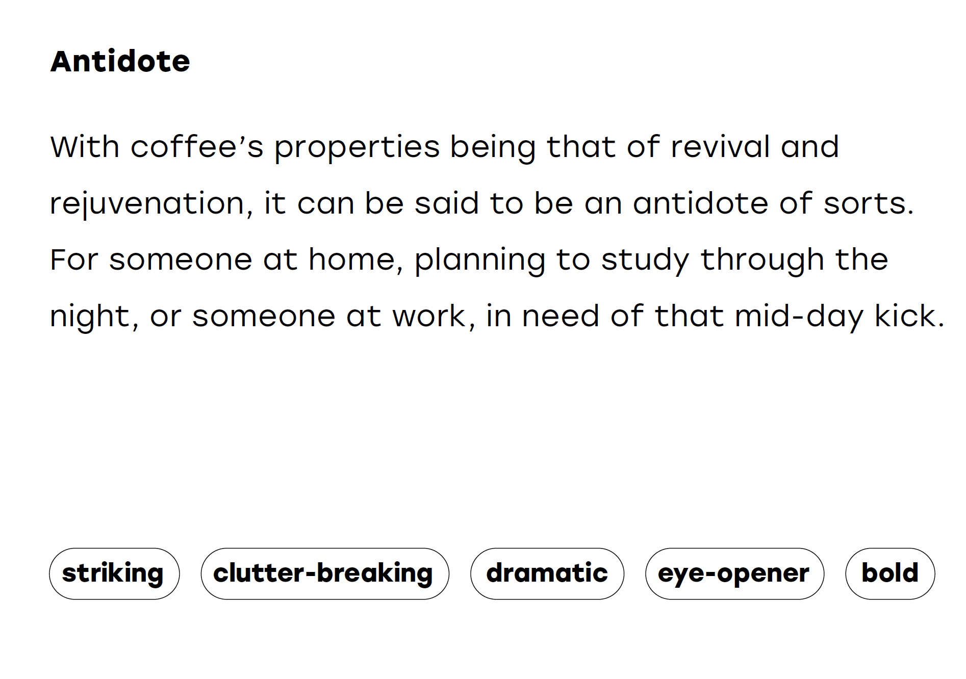
We went through multiple rounds of naming, focussing on a sundry of starting points like: eye-opener names, coined terms, exotic locations, coffee related etc. The name we finally selected was - ‘Antidote Coffee’
Find below the short-listed names that we presented to the client:


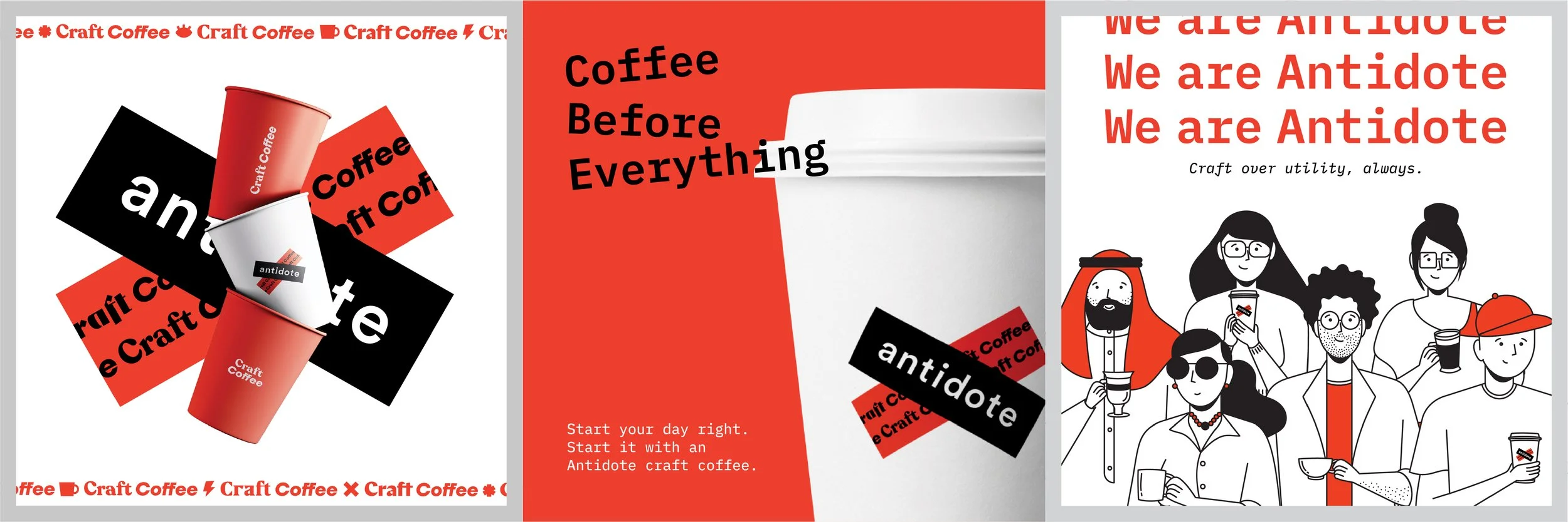
Visual Language
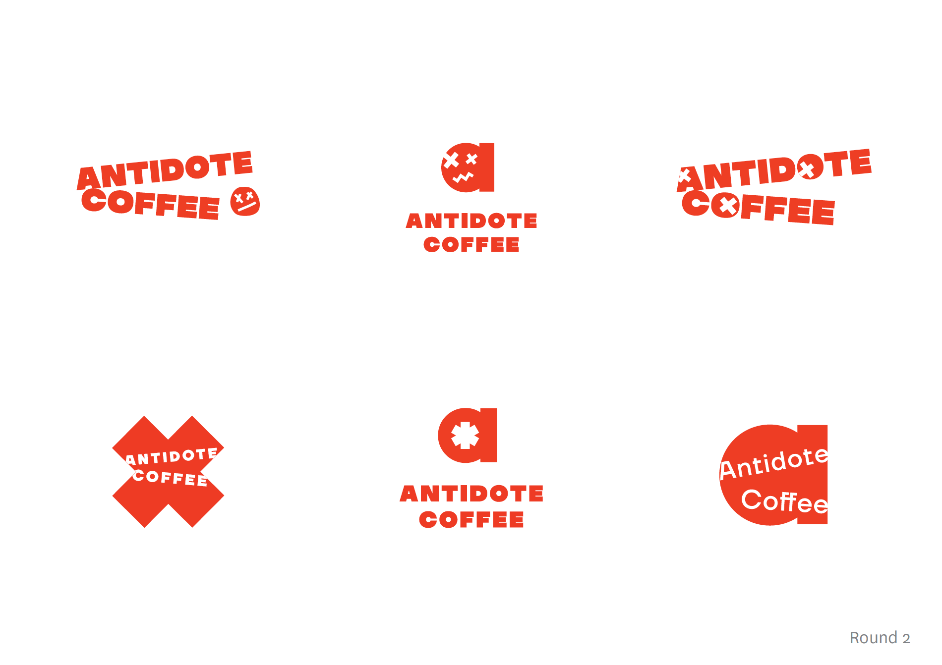
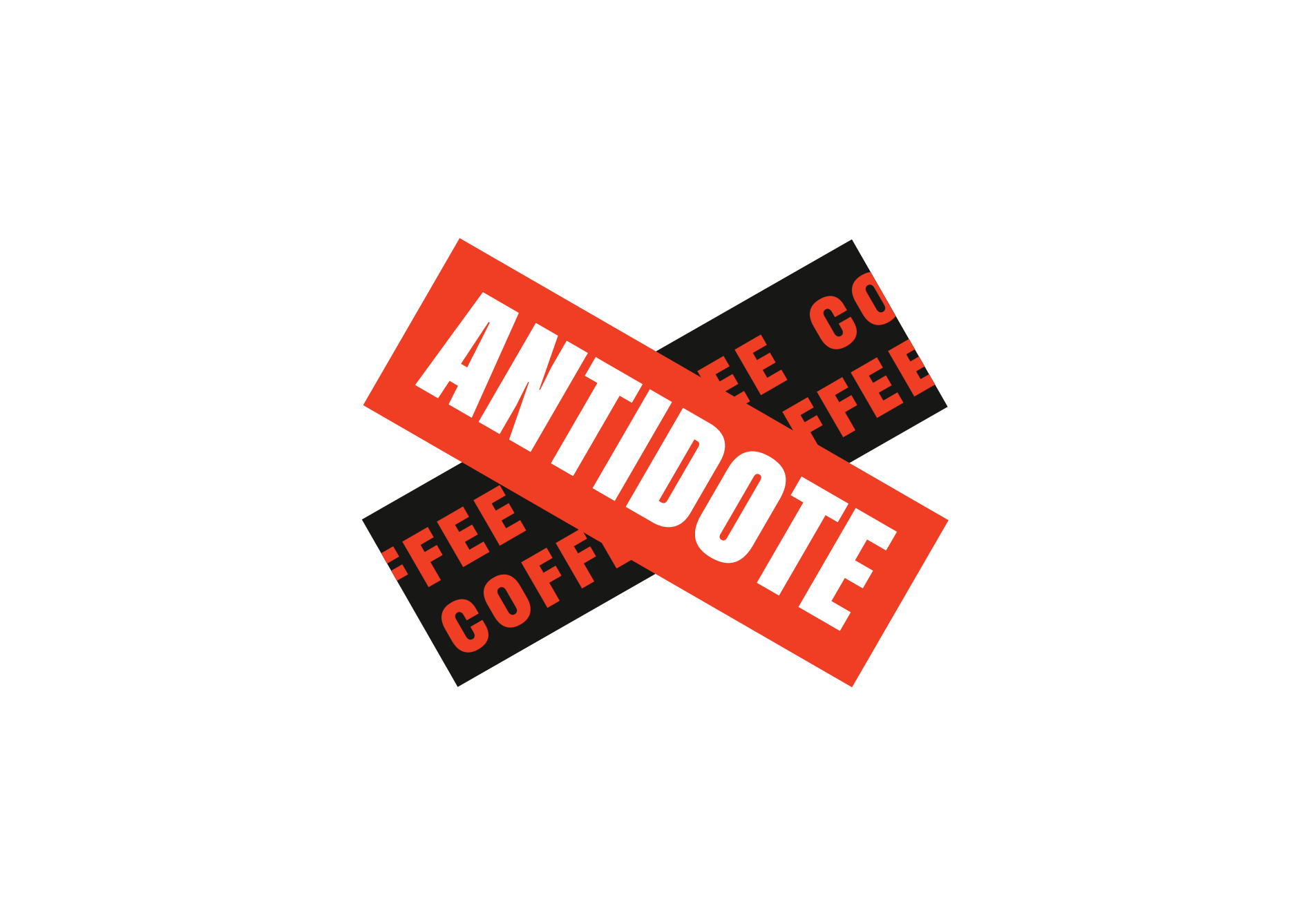
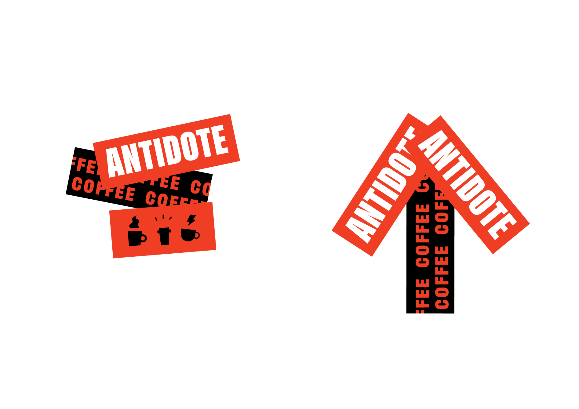
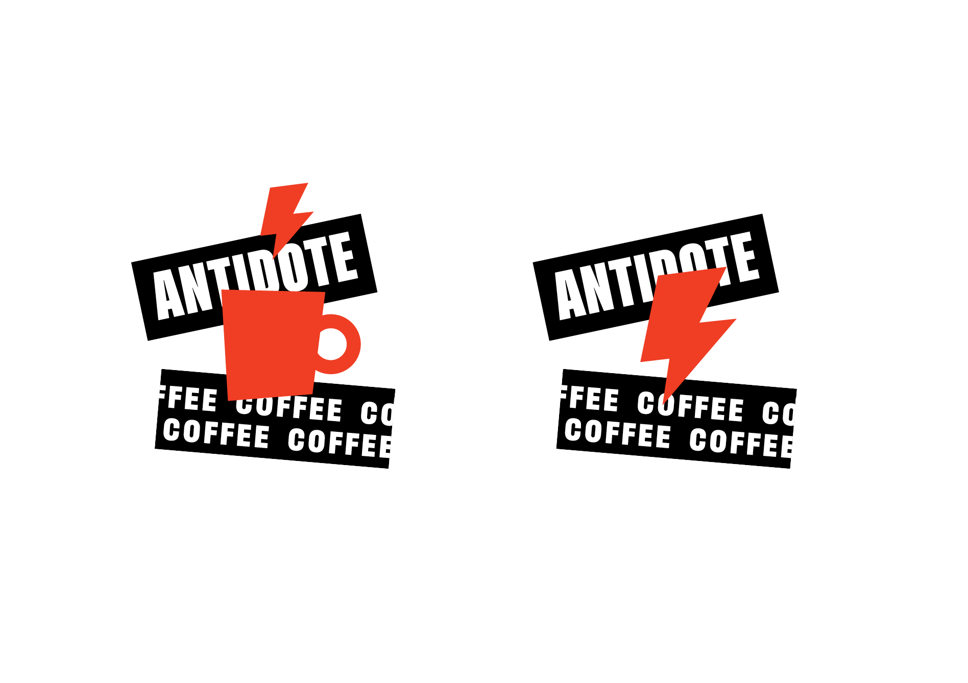
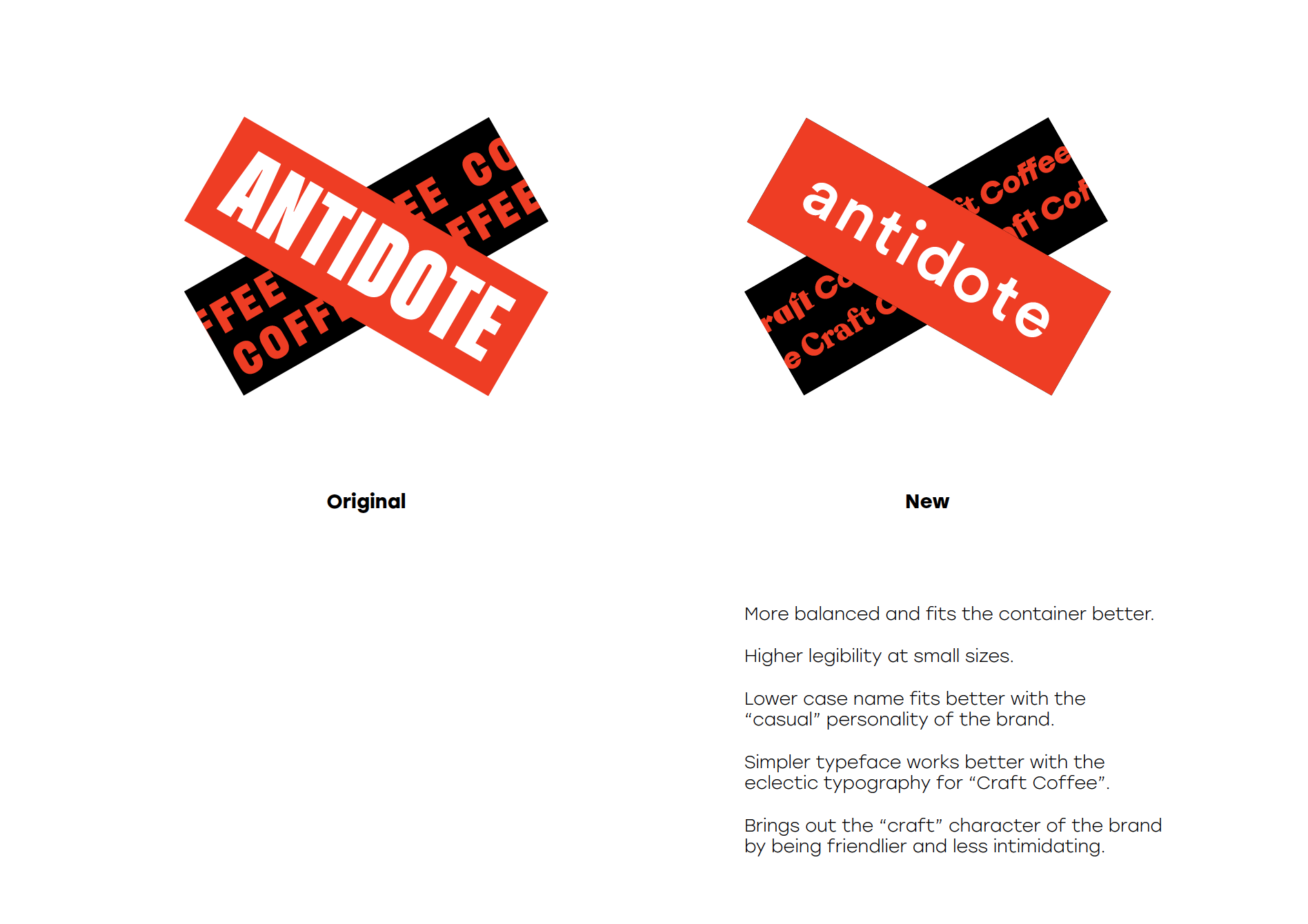
The name Antidote lent a great character to the identity, bringing in the evocative ‘X’ mark and the colour red. The clients were inspired by the identity of brands like Blue Bottle Coffee, Caribou Coffee, Starbucks, but we wanted to approach the identity of Antidote in a brutalist way, as the name itself suggested.
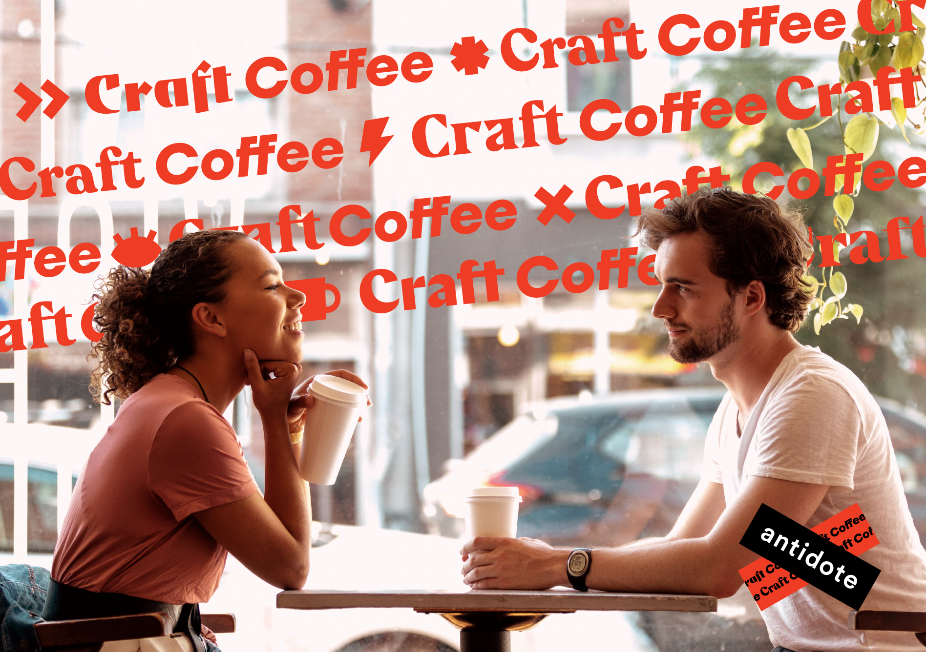
The visual language of the brand had to translate smoothly to customer touchpoints like banner ads, flyers, posters in a polarising manner such that it had great recall value, in some ways covering up for the absence of a physical store.
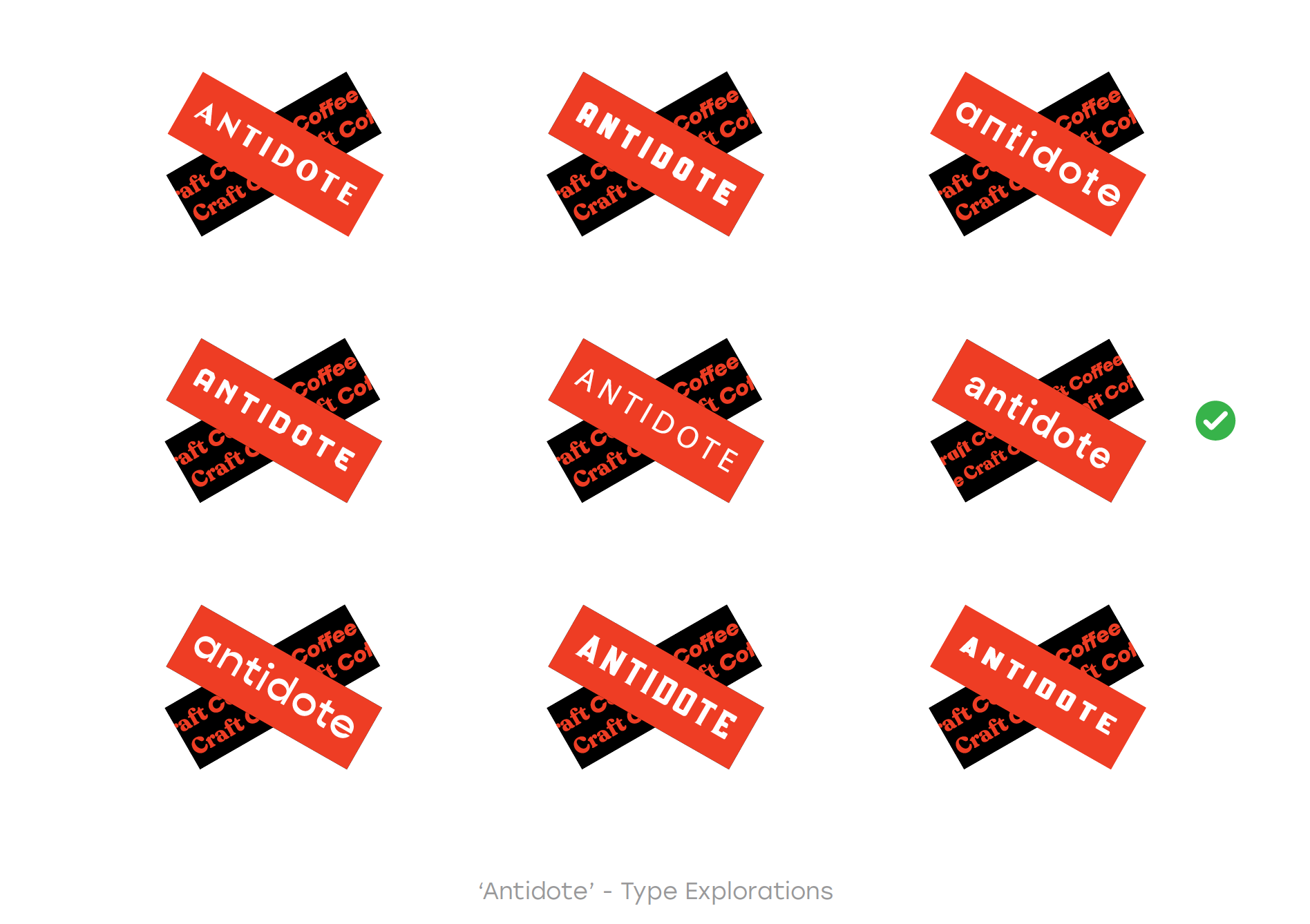
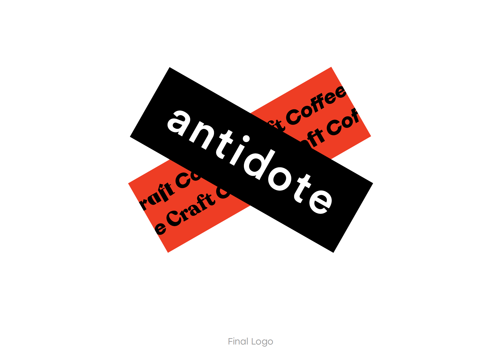
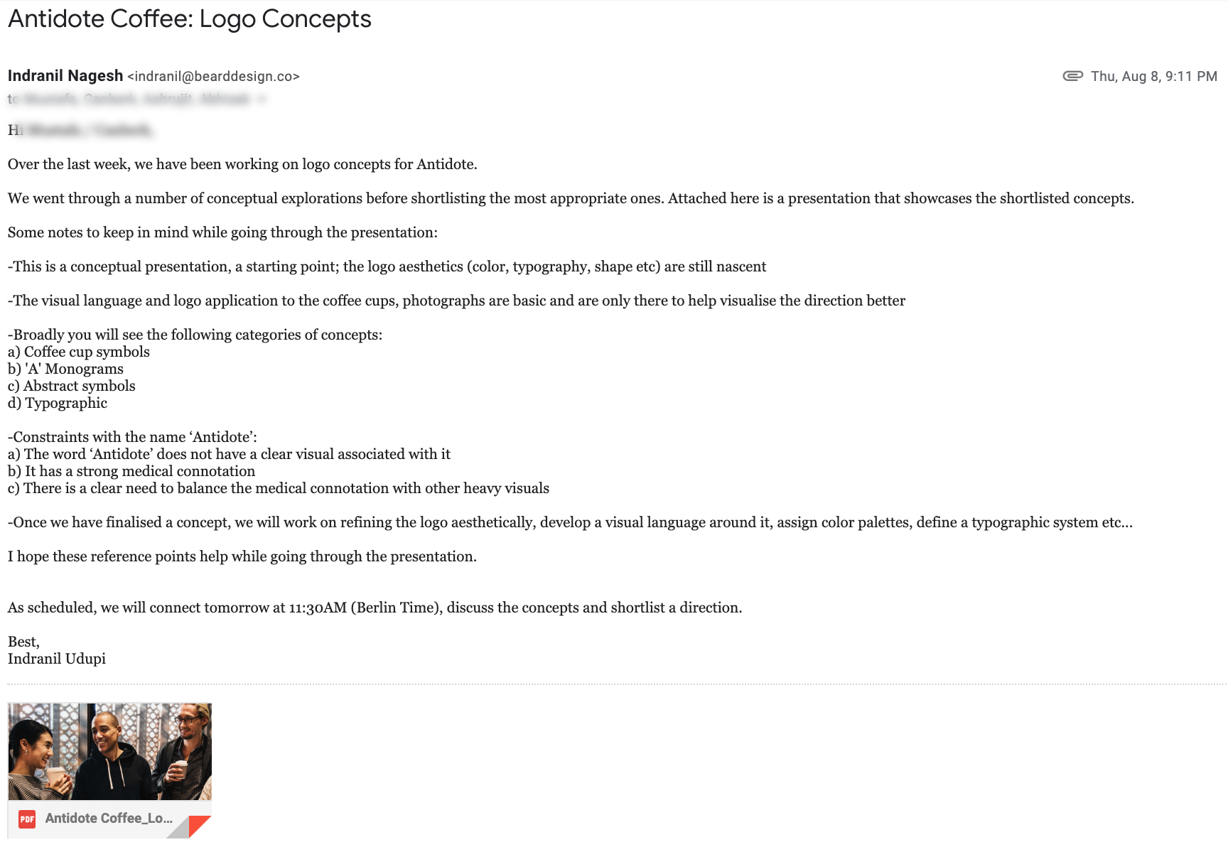
The brand also wanted to venture into selling specialty coffee beans in the future, that would be sold at retail outlets, therefore Antidote had to stand out on a shelf with other brands as well. Find below a bunch of logo explorations and the final logo.


Client Servicing
I lead weekly internal and client team status meetings to ensure alignment and collaboration among teams. I communicated project progress to Business Heads and Marketing Managers. The challenge here was to effectively communicate design decisions that we had taken to the stakeholders of the project.
One such example: Many a times during the course of finalising the visual identity and logo for the brand, the stakeholders felt the designs were very simplistic. But we had to reinstate our decision by explaining how simple design would fit the character of the brand, where the name itself carried so much weight.
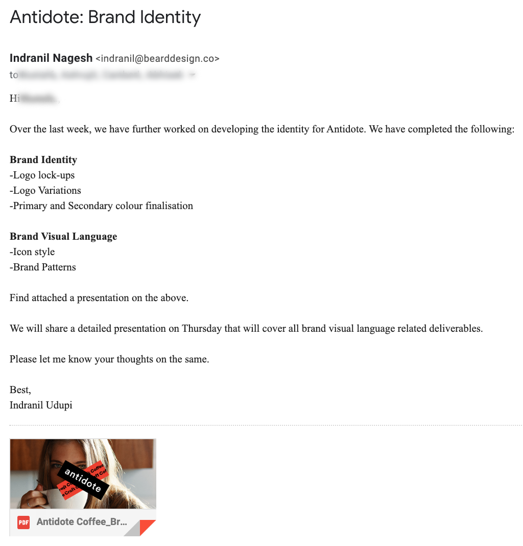
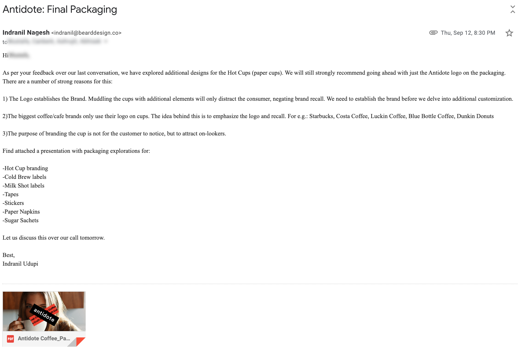
You will find below examples of the detailed communication that needed to be carried out.

Learnings
This experience helped me understand the dealings with a global conglomerate. It taught me new ways to communicate with top-level stakeholders. It allowed me to think quickly and respond to crucial client questions about our ideas and decision making while discussing project deliverables. In a holistic sense, this experience prepared me to handle future projects that involved dealing big-clients and their expectations.